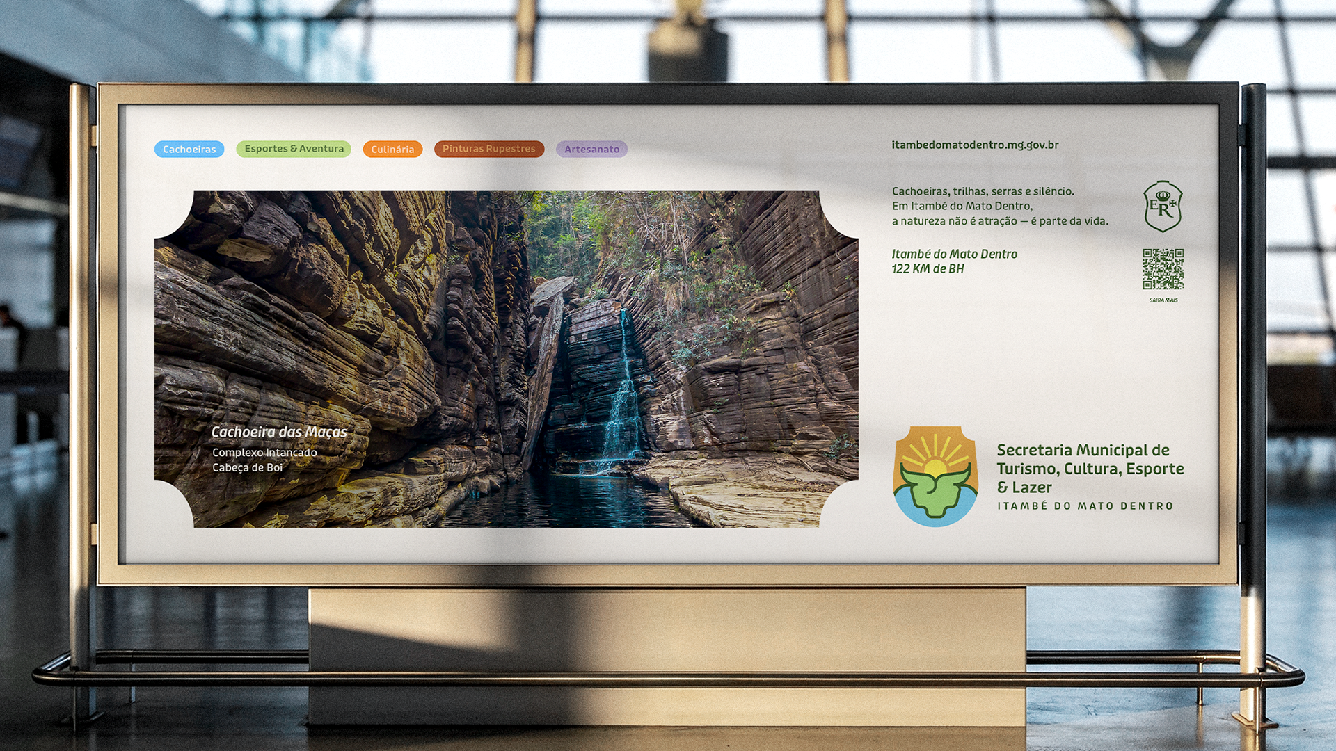
Client: Secretaria de Turismo de Itambé do Mato Dentro - Minas Gerais
About: Turismo
Year: 2026
Follow for More: @OLENNITA
pt//
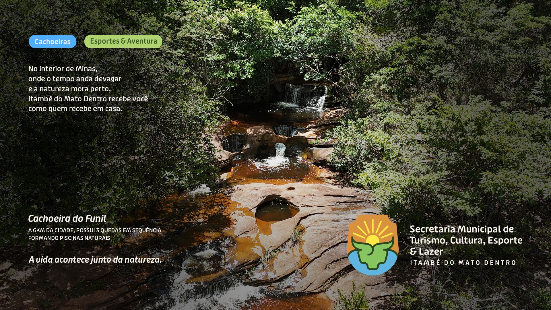
Este projeto apresenta o sistema de Identidade Visual e comunicação turística de Itambé do Mato Dentro, município localizado no interior de Minas Gerais, Brasil. Mais do que promover um destino, a proposta parte do entendimento de que Itambé é um lugar onde a natureza não atua como cenário, mas como parte da vida cotidiana. Cachoeiras, serras, trilhas, cultura, fé e vida rural coexistem de forma orgânica e moldam a maneira como a cidade se constrói, se reconhece e recebe.
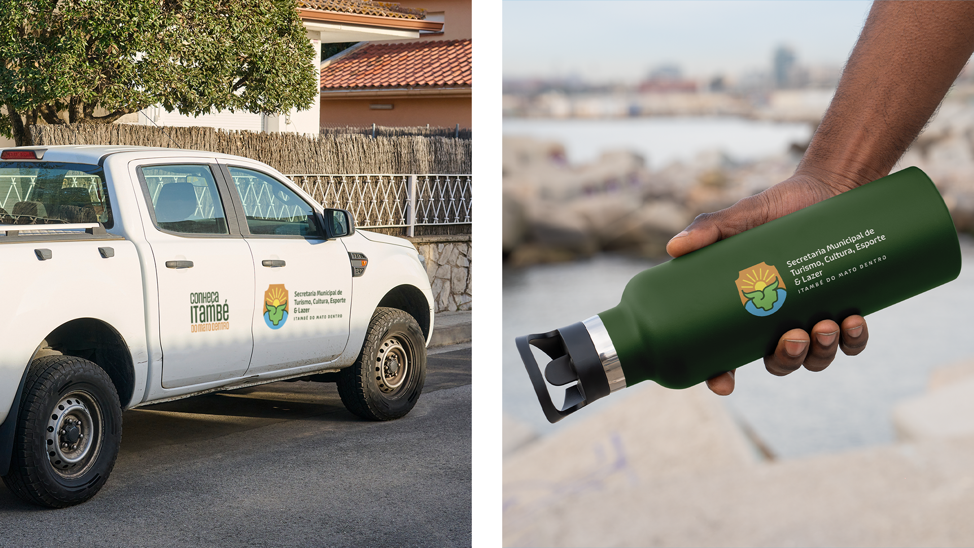
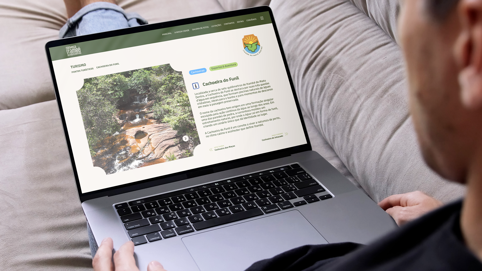
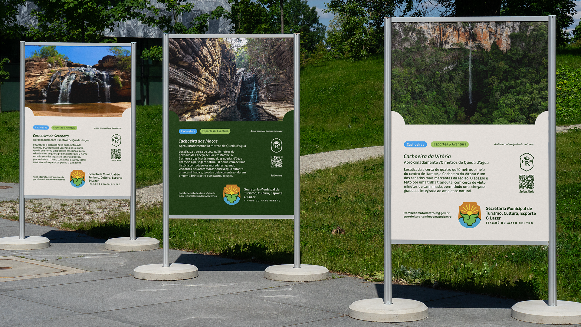
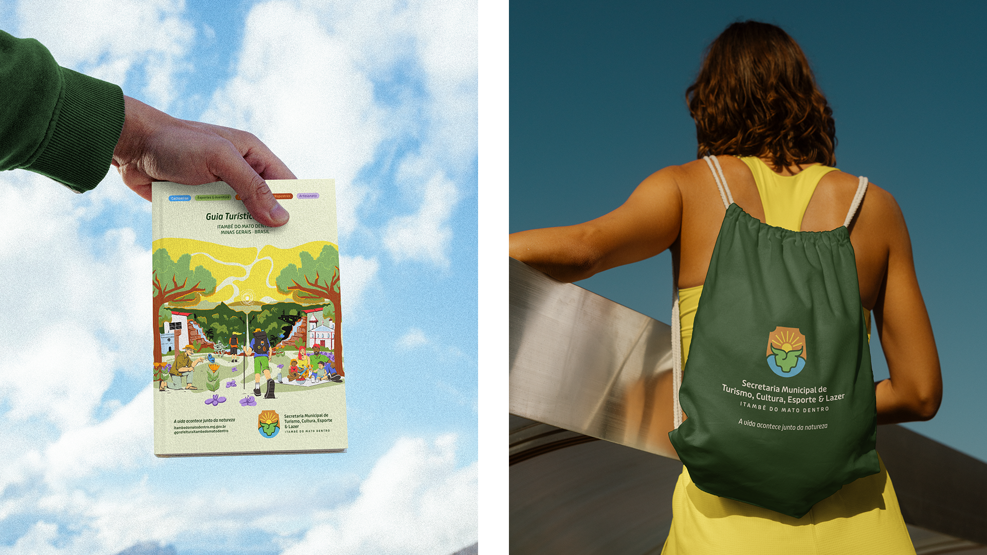
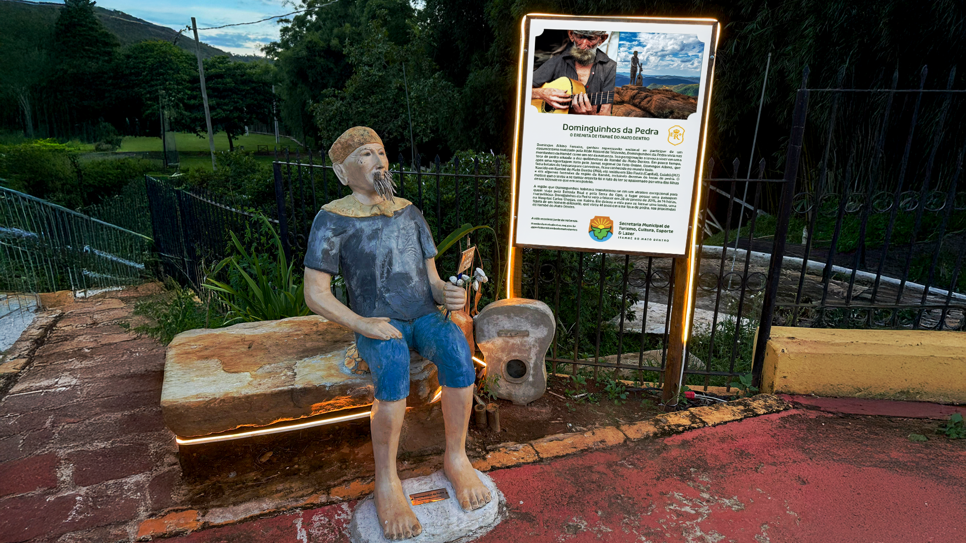
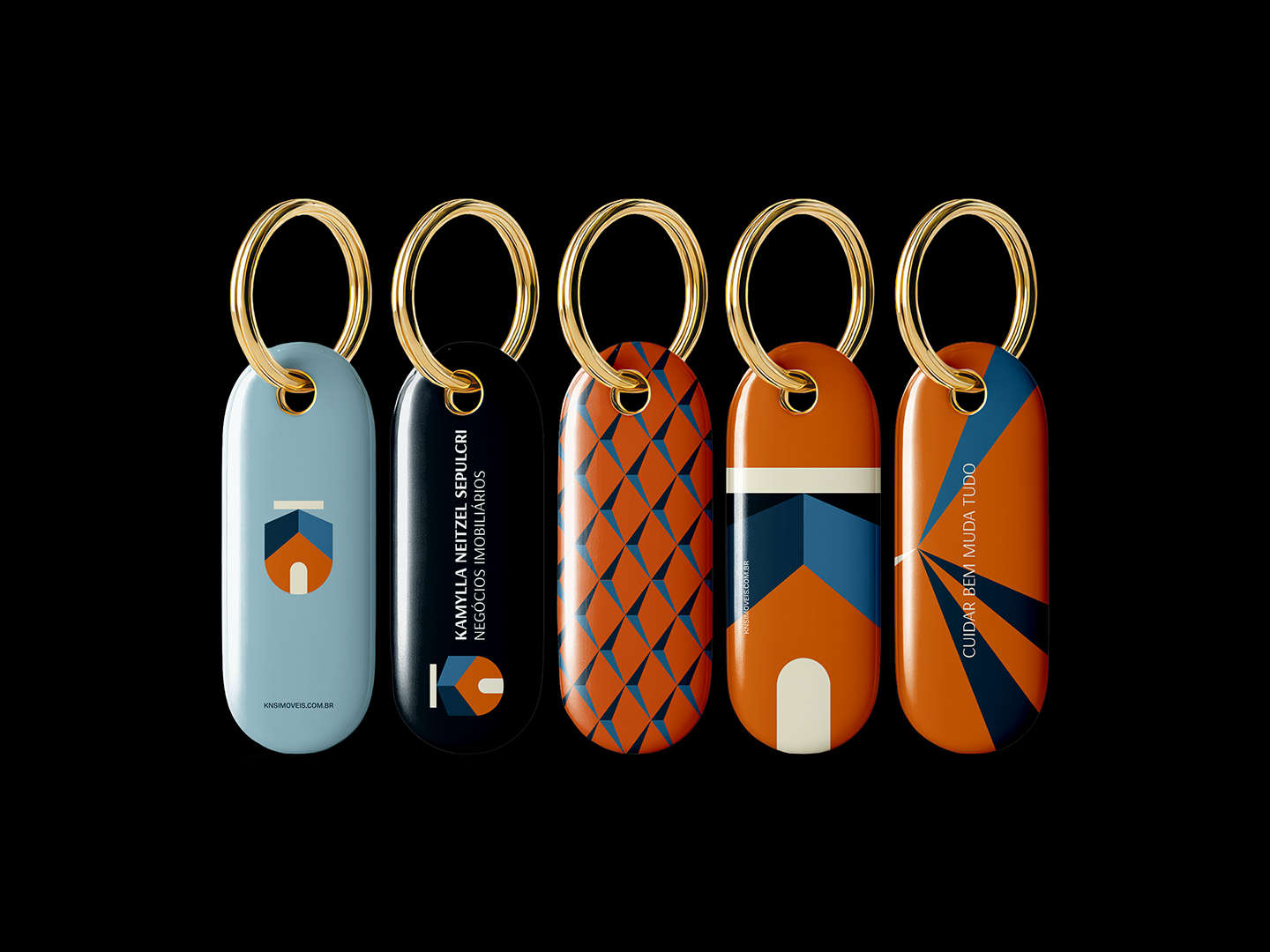
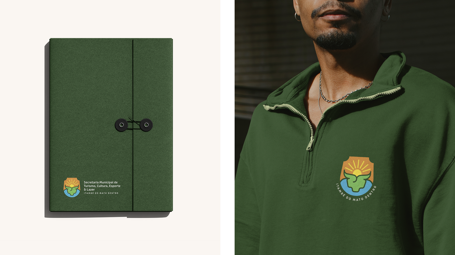
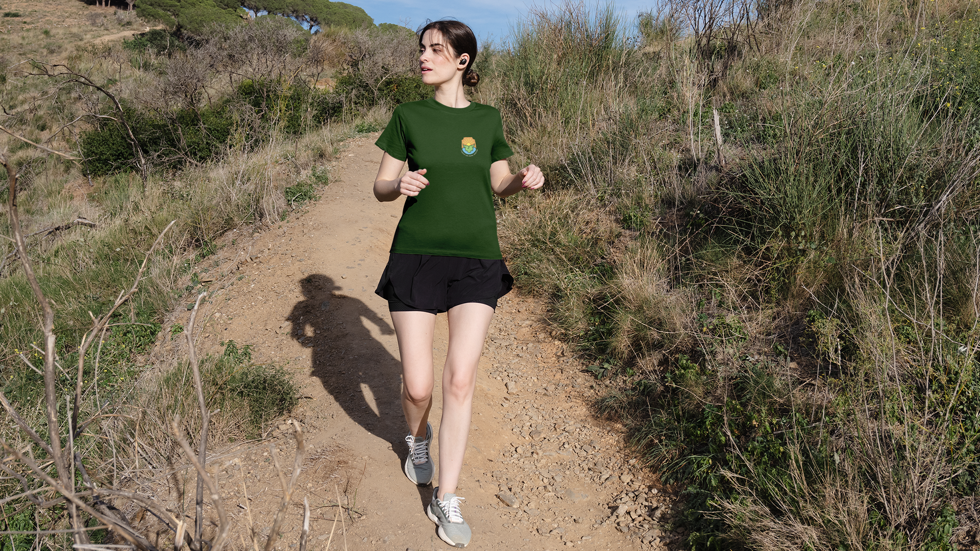
A Identidade foi desenvolvida a partir de uma leitura profunda do território, com foco em criar um sistema visual claro, institucional e duradouro, capaz de organizar a diversidade de experiências do município sem descaracterizá-las. O projeto integra logotipo, paleta cromática, tipografia, ilustração, iconografia e linguagem verbal em uma estrutura única, preparada para atuar em campanhas, sinalização, materiais informativos e comunicação pública.
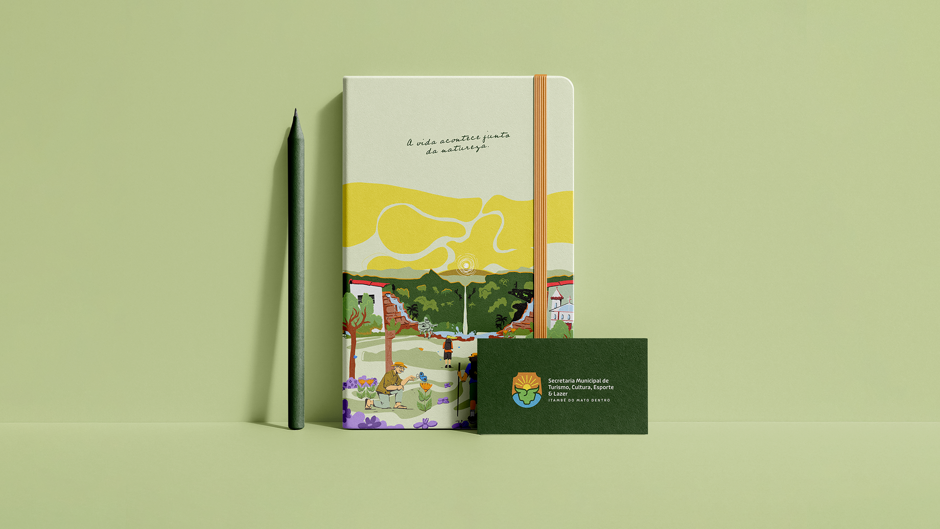
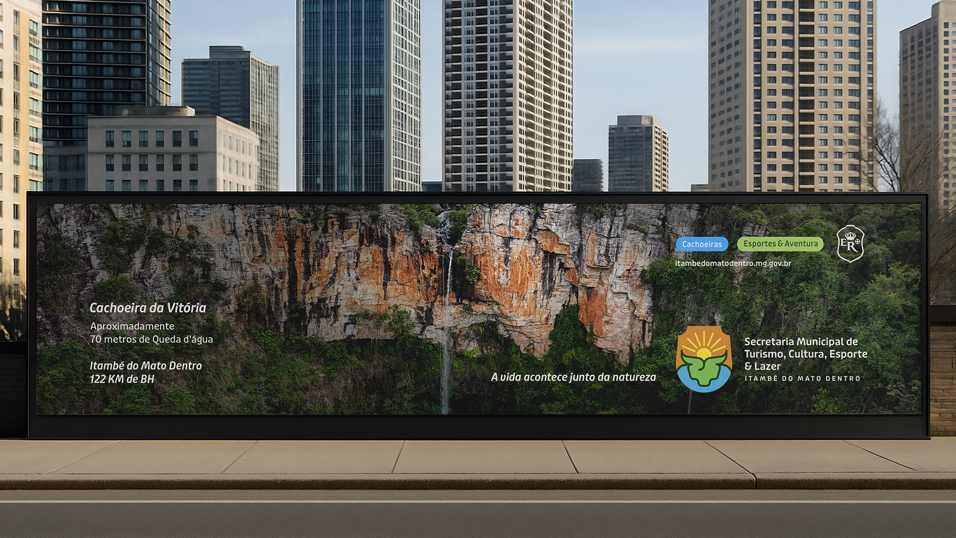
O slogan “A vida acontece junto da natureza” sintetiza o posicionamento da marca ao comunicar pertencimento, proximidade e convivência. Ele fala tanto com quem vive em Itambé quanto com quem chega, reforçando a natureza como presença constante e não como atração isolada.
Este projeto não cria uma imagem idealizada do lugar.
Ele organiza, traduz e sustenta visualmente um modo de viver que já existe.
Ele organiza, traduz e sustenta visualmente um modo de viver que já existe.
en//
This project presents the visual identity and tourism communication system developed for Itambé do Mato Dentro, a municipality located in the countryside of Minas Gerais, Brazil. Rather than promoting an idealized destination, the project is grounded in the understanding that, in Itambé, nature is not a backdrop — it is part of everyday life. Waterfalls, mountains, trails, culture, faith and rural life coexist naturally and shape how the city is experienced, inhabited and shared.
The identity was built from a deep territorial analysis, aiming to create a clear, institutional and long-lasting visual system capable of organizing the city’s diverse experiences without reducing their authenticity. The project integrates logo, color palette, typography, illustration, iconography and verbal language into a cohesive structure designed to operate across campaigns, signage, informational materials and public communication.
The slogan “Life happens alongside nature” expresses the brand’s positioning by emphasizing belonging, proximity and coexistence. It speaks equally to residents and visitors, presenting nature as a constant presence rather than a tourist attraction.
This project does not invent a narrative.
It visually structures a way of life that already exists.
It visually structures a way of life that already exists.
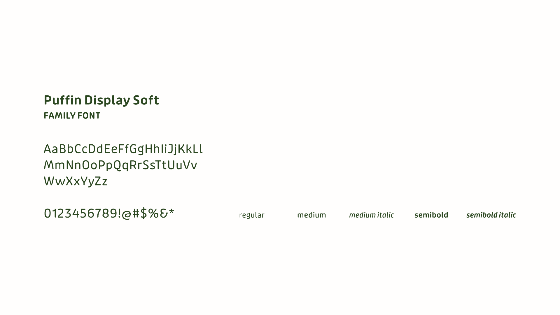
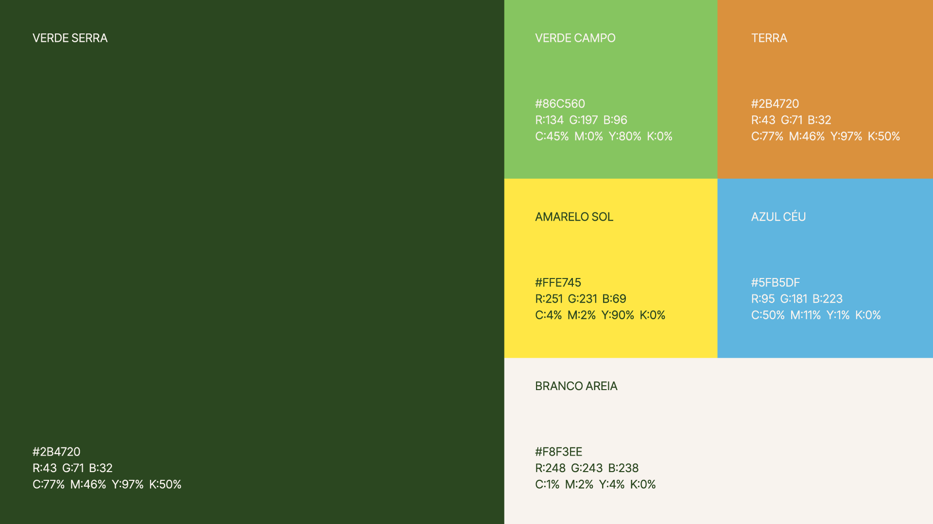
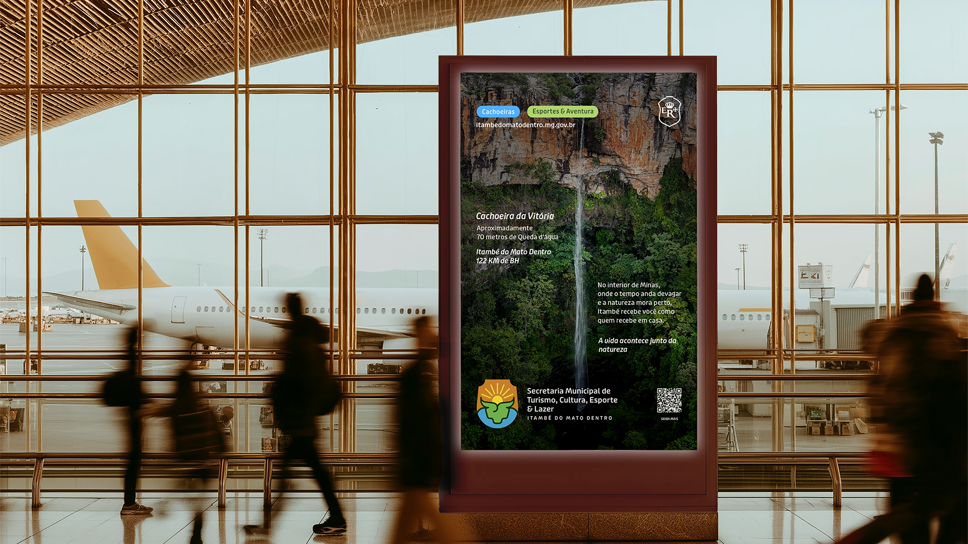
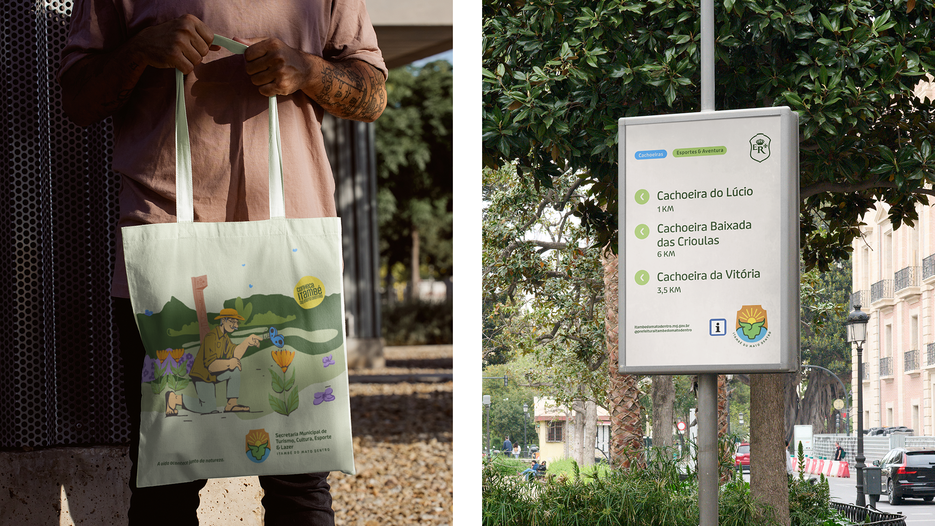
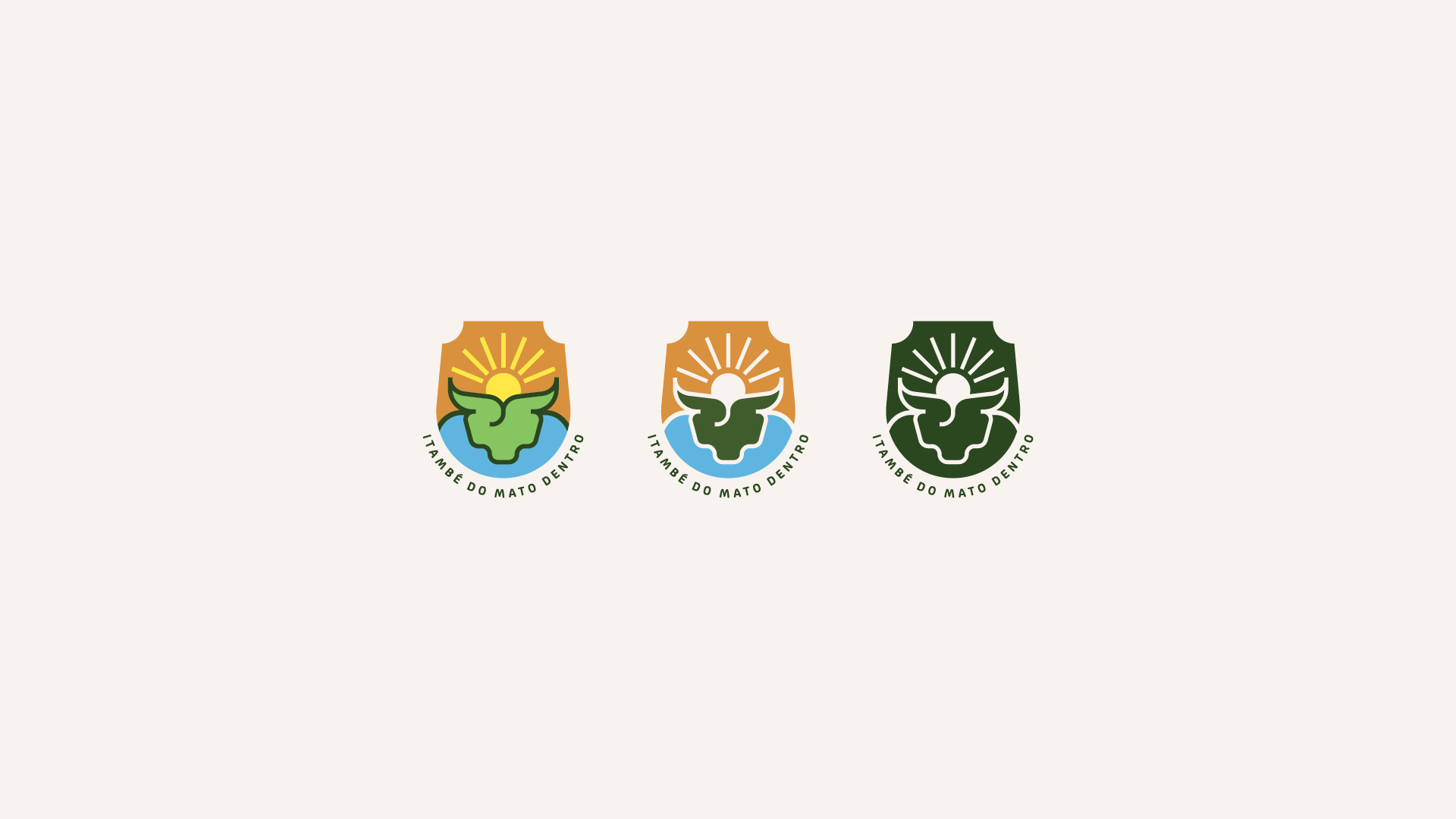
A paleta cromática e a tipografia principal foram definidas a partir da paisagem e do ritmo de Itambé do Mato Dentro. As cores refletem o território como ele é vivido — orgânico, natural e acolhedor — enquanto a Puffin Display traz personalidade e proximidade à comunicação, equilibrando presença institucional com clareza e humanidade.
The color palette and the primary typeface were defined from the landscape and rhythm of Itambé do Mato Dentro. The colors reflect the territory as it is lived — organic, natural and welcoming — while Puffin Display brings warmth and personality to the communication, balancing institutional presence with clarity and a human tone.
Desafio & Solução
O principal desafio do projeto foi criar uma Identidade turística para um território diverso e vivo, sem reduzi-lo a um único símbolo ou a uma narrativa genérica. Itambé do Mato Dentro reúne natureza, cultura, fé, vida rural e diferentes polos turísticos, exigindo uma comunicação capaz de representar essa complexidade com responsabilidade pública.
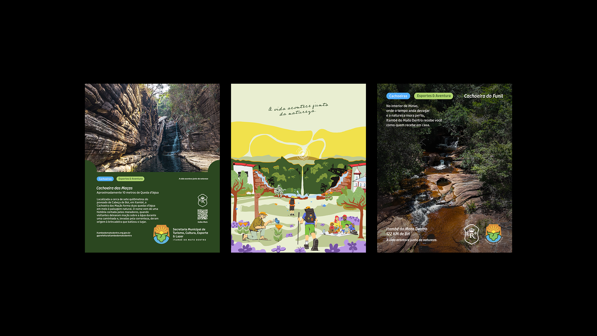
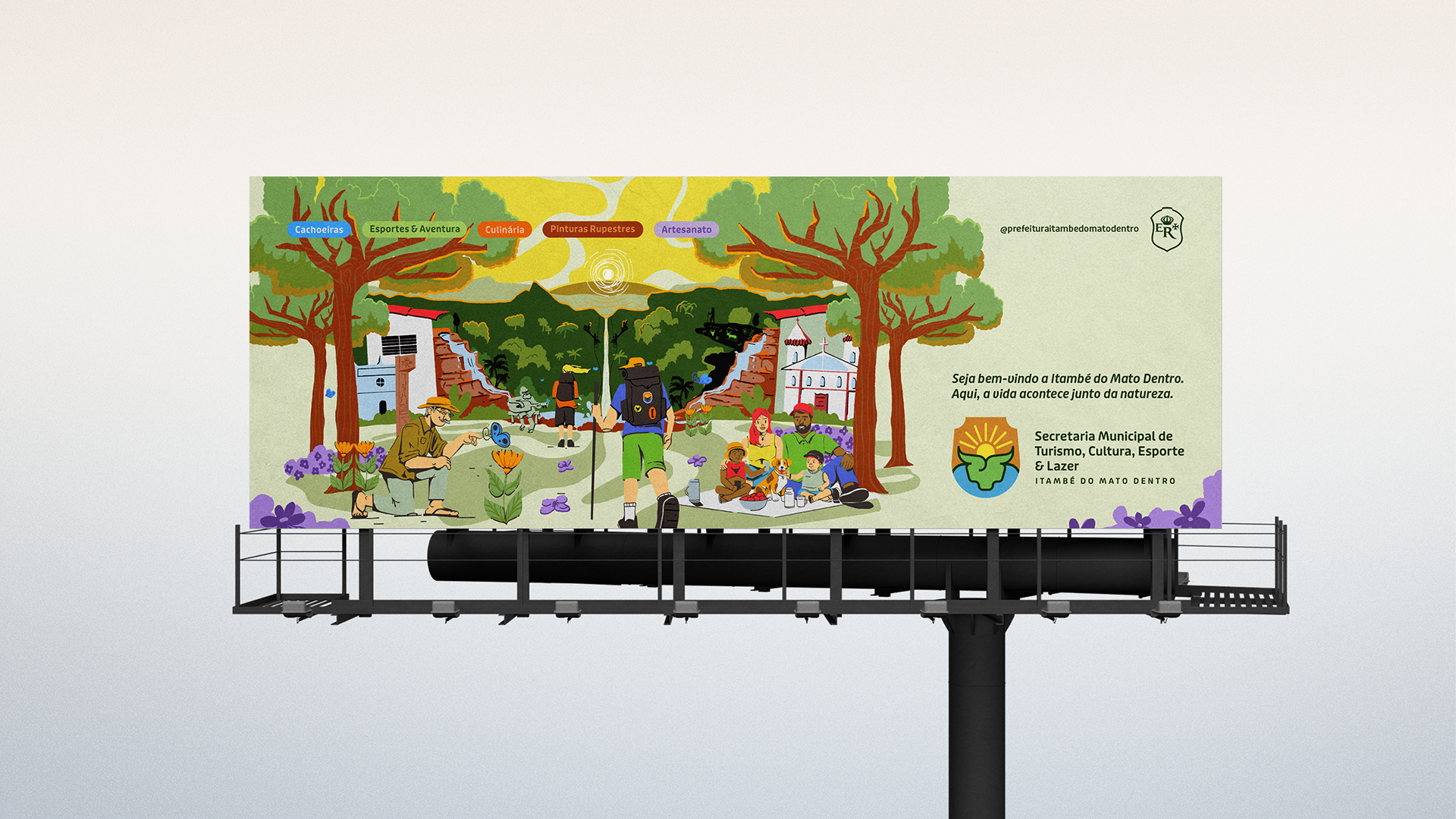
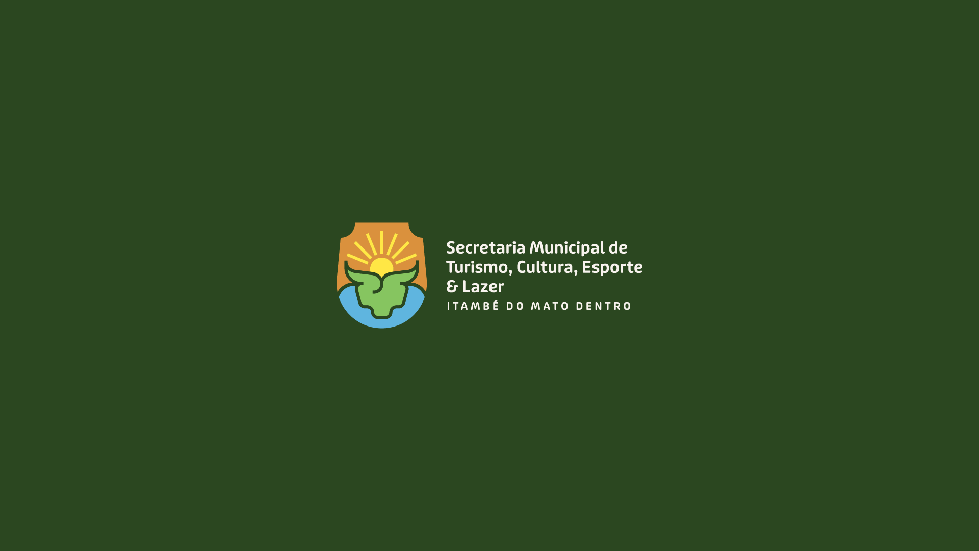
A solução foi desenvolver a identidade como sistema, e não como peça isolada. O logotipo atua como síntese institucional, o slogan posiciona a marca a partir da convivência com a natureza, e a ilustração assume o papel narrativo, reunindo os principais elementos do território. Cores, tipografia e iconografia organizam a informação e garantem consistência nos diferentes pontos de contato. O resultado é uma identidade que não idealiza o lugar, mas estrutura visualmente um modo de viver que já existe — clara, acolhedora e preparada para o tempo.
Challenge & Solution
The main challenge of this project was to create a tourism identity for a territory that is diverse, active and deeply rooted in everyday life — without reducing it to a single symbol or a generic visual narrative. Itambé do Mato Dentro brings together nature, culture, faith, rural life and multiple tourist areas, demanding a public identity capable of representing this complexity with clarity and responsibility.
The solution was to approach the identity as a system, rather than a standalone design. The logo works as an institutional synthesis, the slogan positions the brand around coexistence with nature, and the illustration assumes a narrative role by bringing together the city’s most significant elements. Color, typography and iconography organize information and ensure consistency across all applications. The result is an identity that does not idealize the place, but visually structures a way of life that already exists — clear, welcoming and built to last.
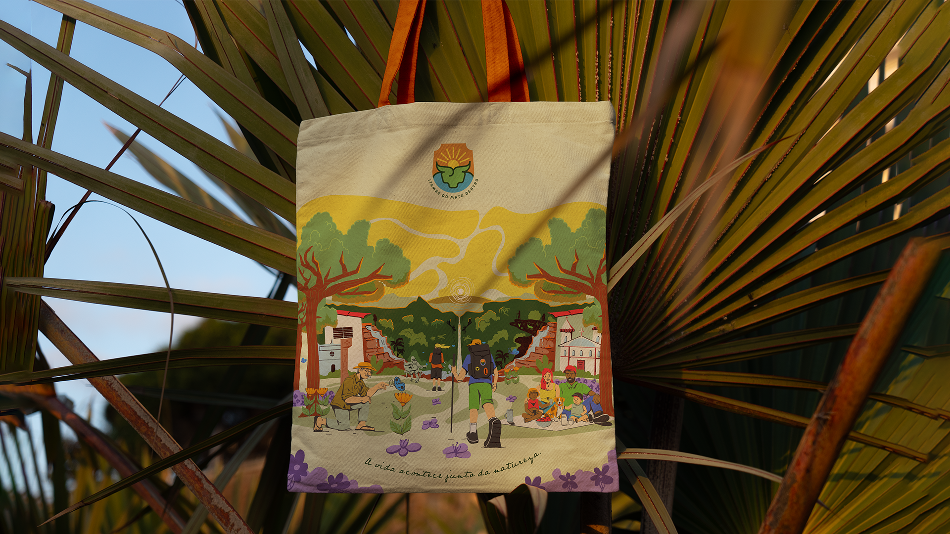
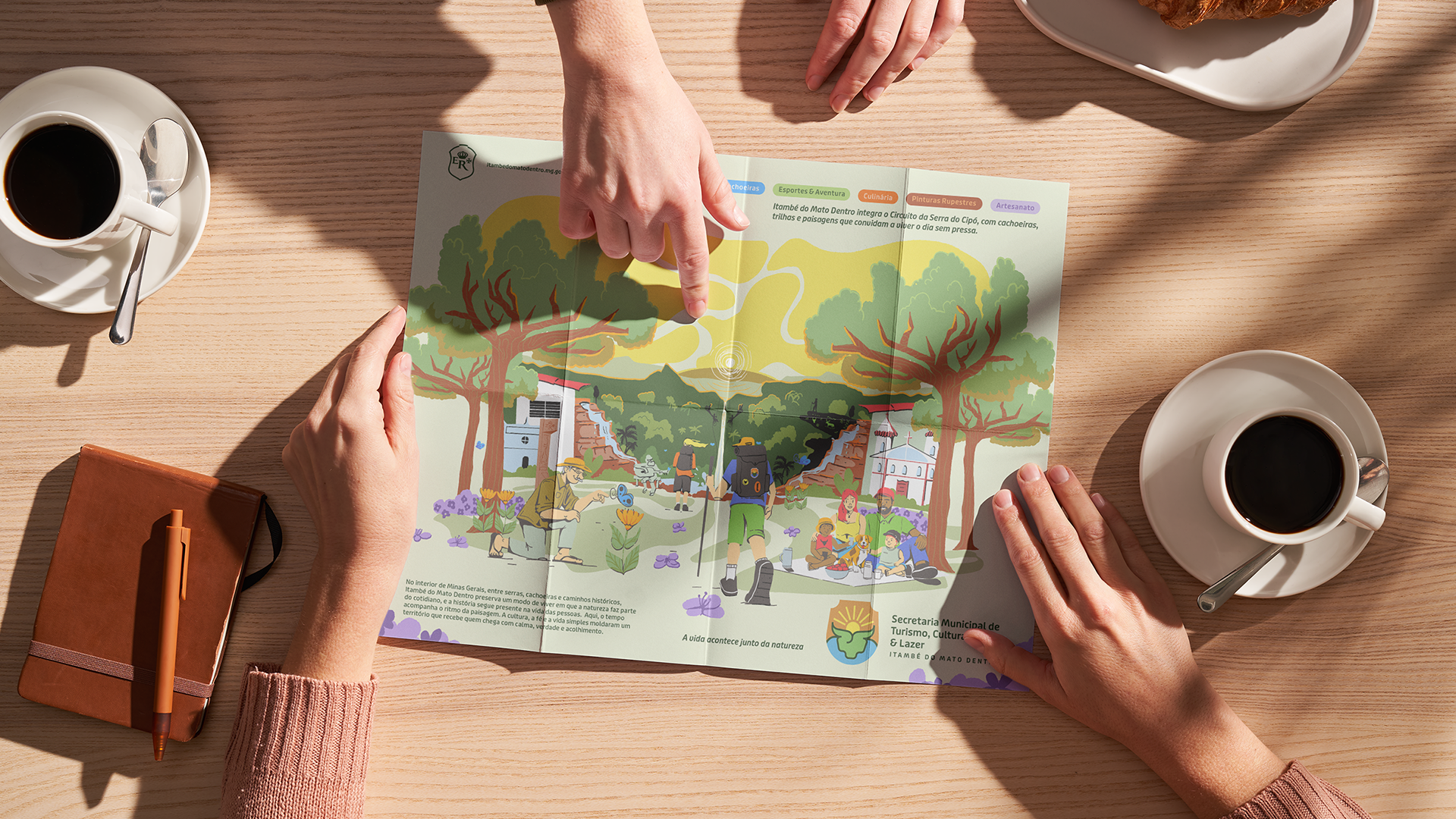
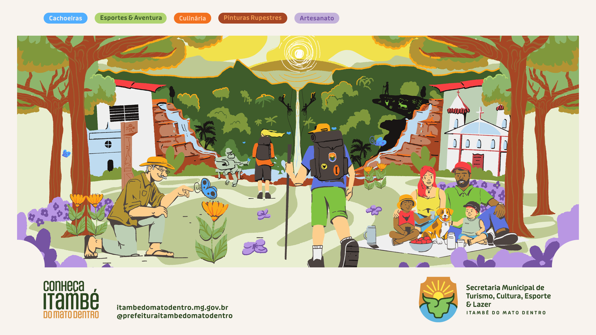
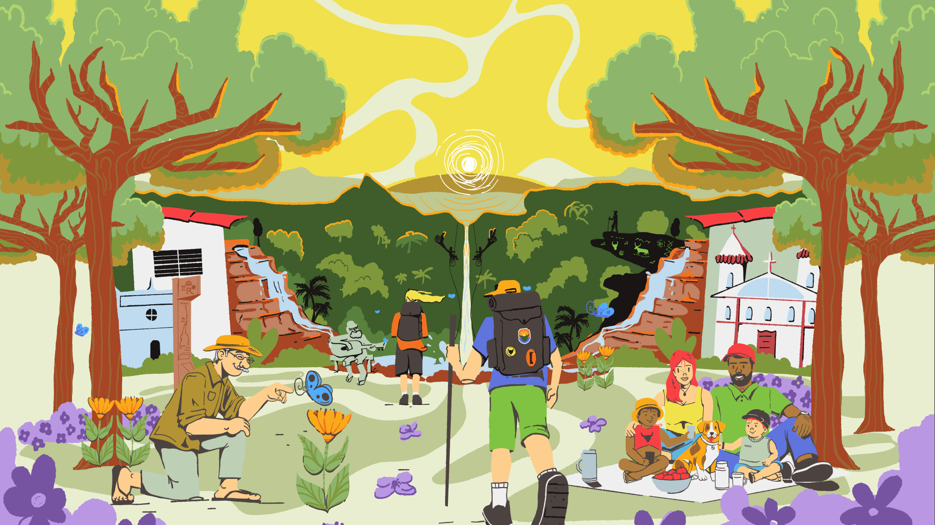
Neste projeto, a ilustração atua como camada narrativa estratégica.
Em vez de retratar atrações isoladas, ela constrói um ecossistema visual onde natureza, cultura e vida cotidiana coexistem. Cachoeiras, paisagem, vida rural e símbolos locais se conectam para comunicar continuidade, e não espetáculo. A ilustração não compete com o logotipo — ela o expande. Enquanto o logotipo organiza, a ilustração contextualiza e aproxima.
In this project, illustration is a strategic narrative layer.
Rather than depicting isolated attractions, it builds a visual ecosystem where nature, culture and daily life coexist. Waterfalls, rural life, landscape and local symbols are brought together to express continuity instead of spectacle.
The illustration does not compete with the logo — it extends it. While the logo provides institutional structure, the illustration carries context, memory and place, helping the city communicate with clarity and authenticity.