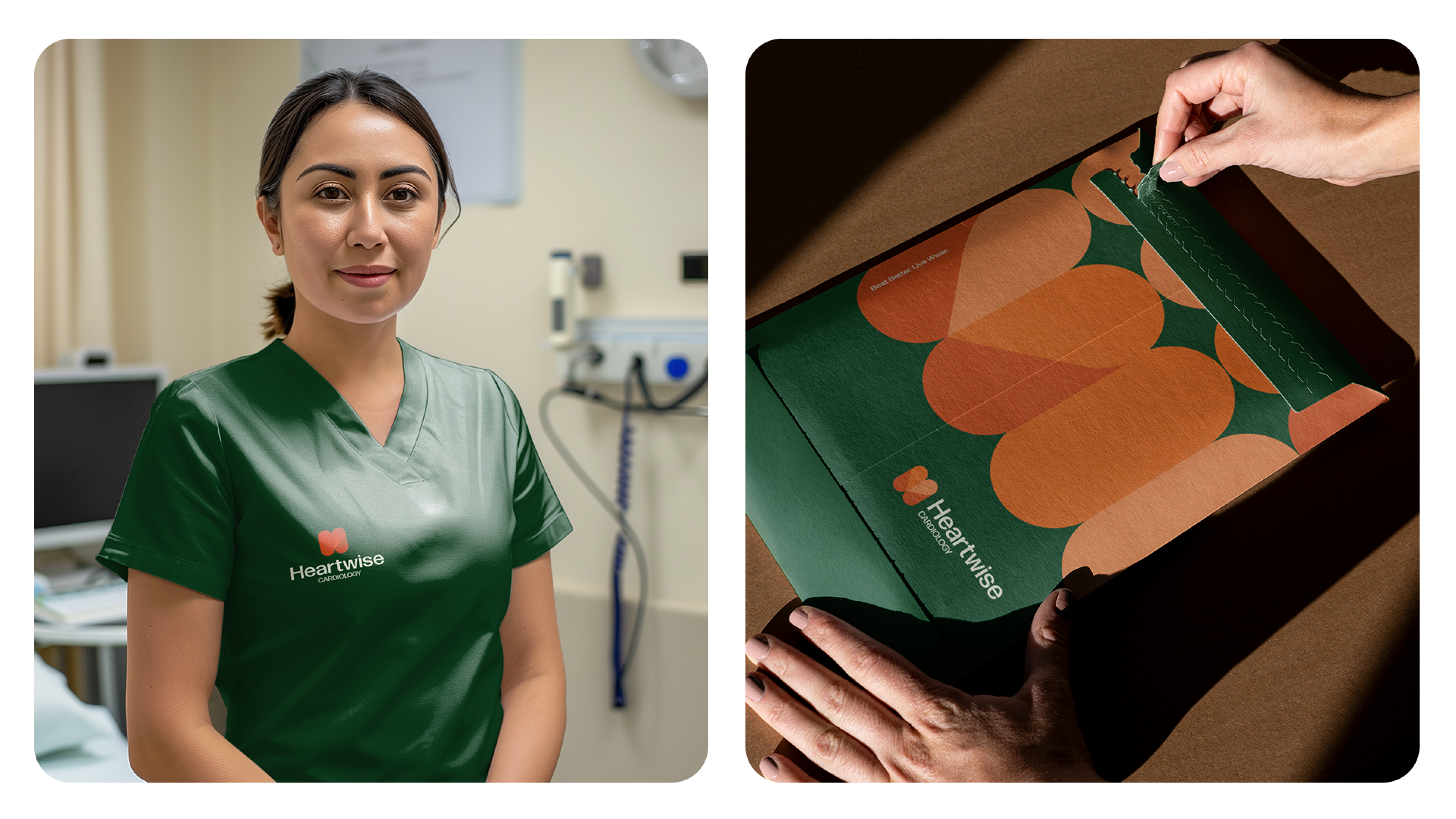
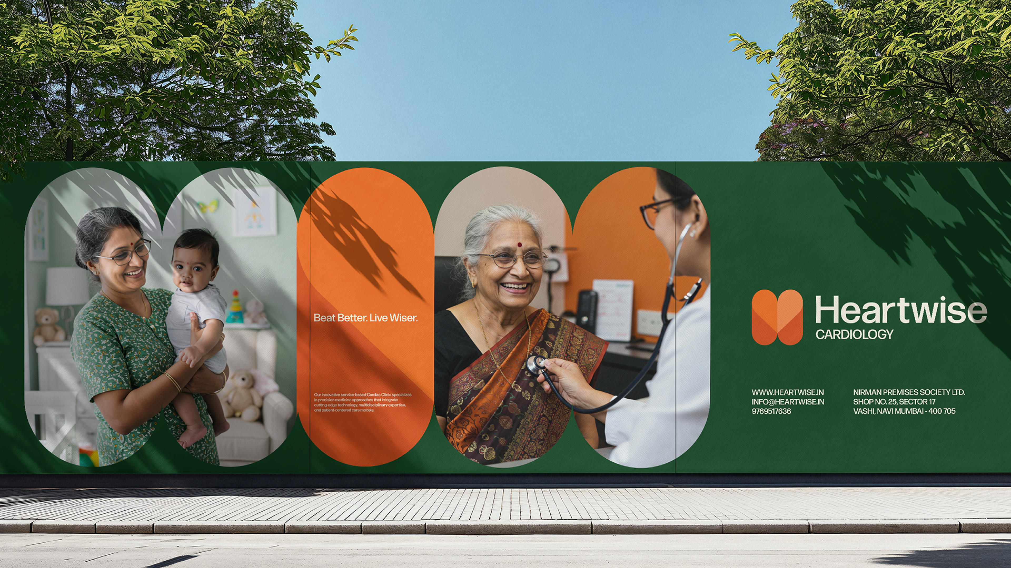
The challenge was to create a Visual Identity that captures the innovative essence of Heartwise Cardiology, a clinic revolutionizing cardiac care in India. The brand needed to simultaneously communicate medical precision and a humanized approach – a delicate balance between cutting-edge technology and human warmth.
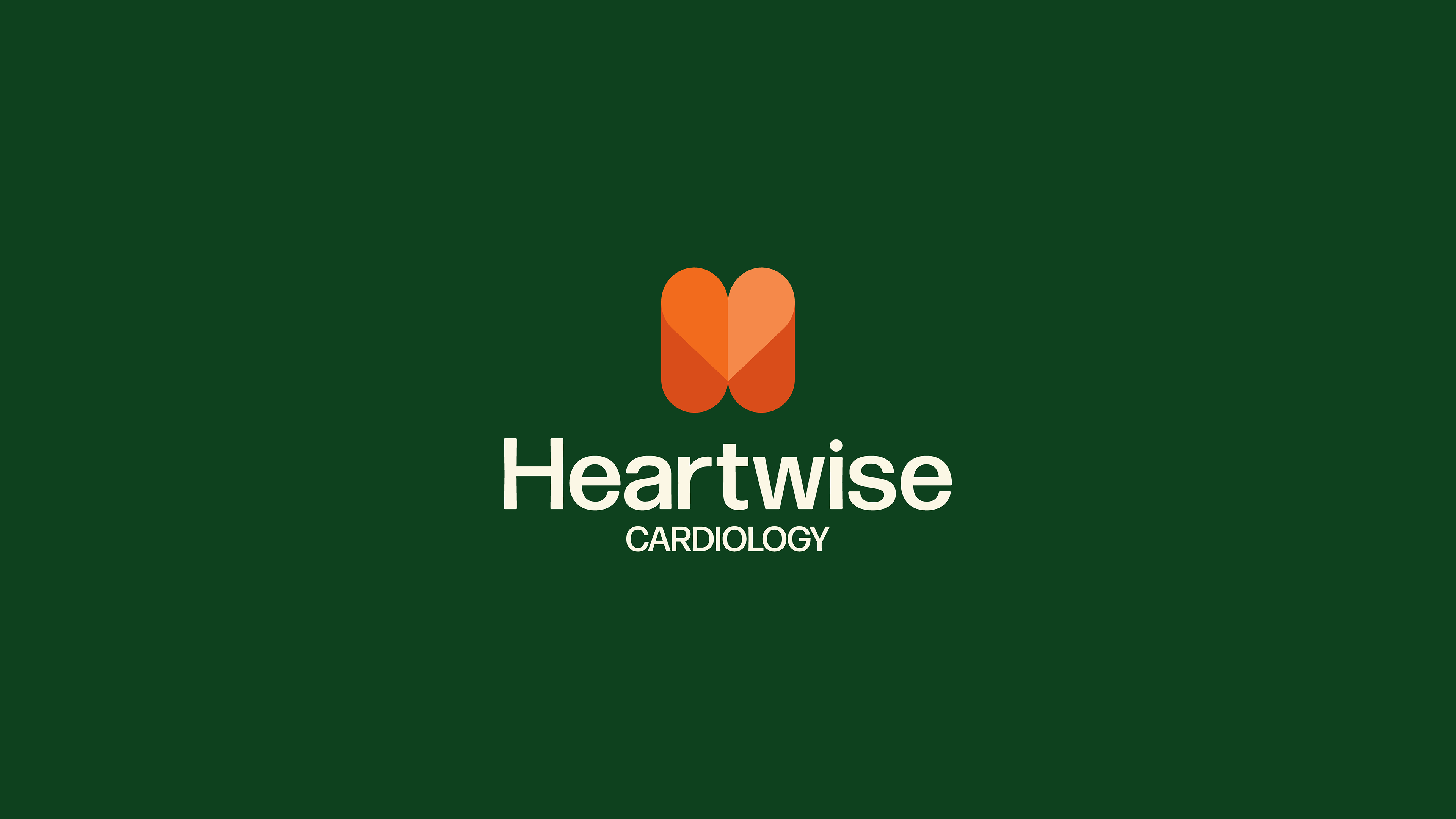
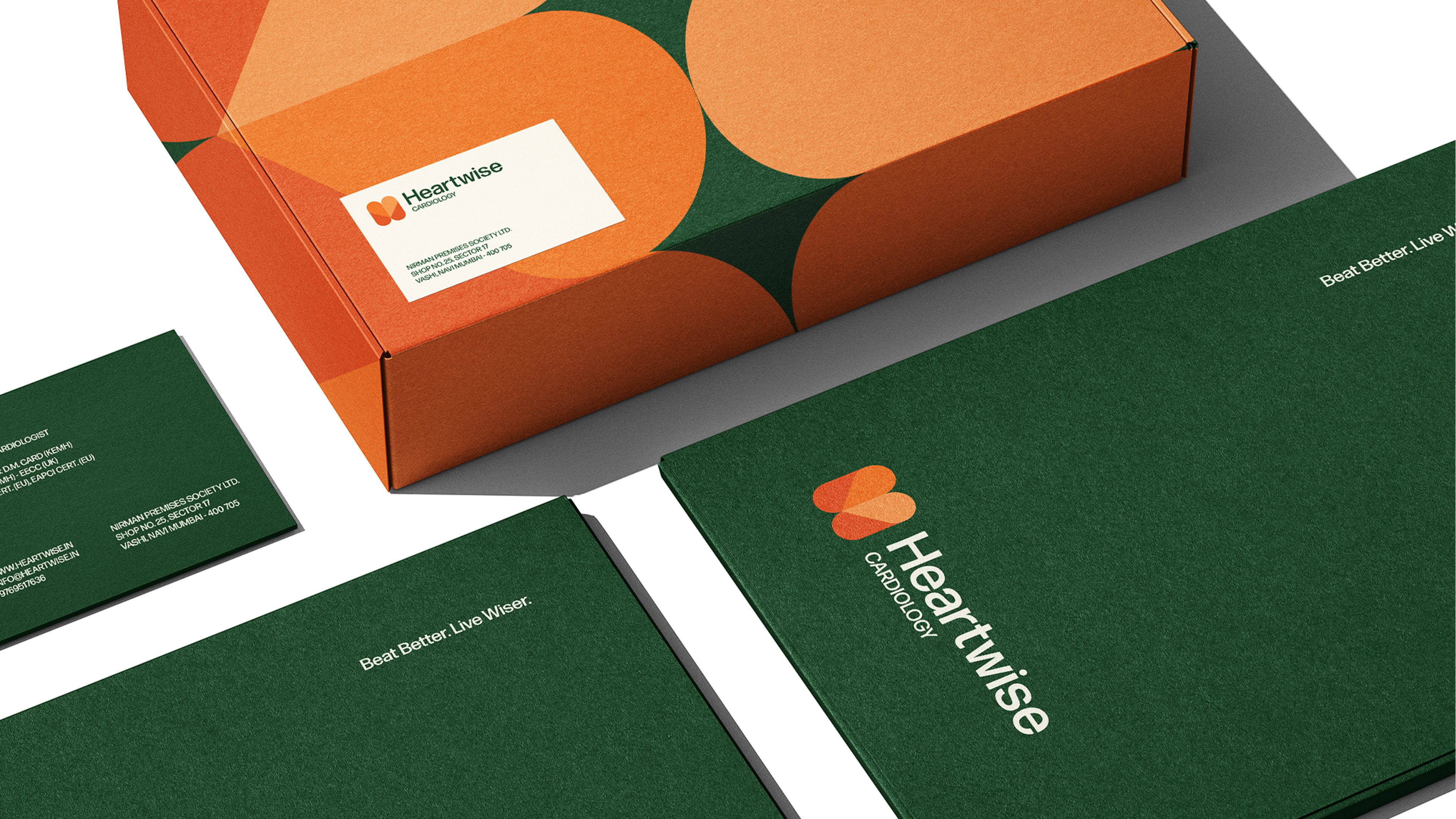
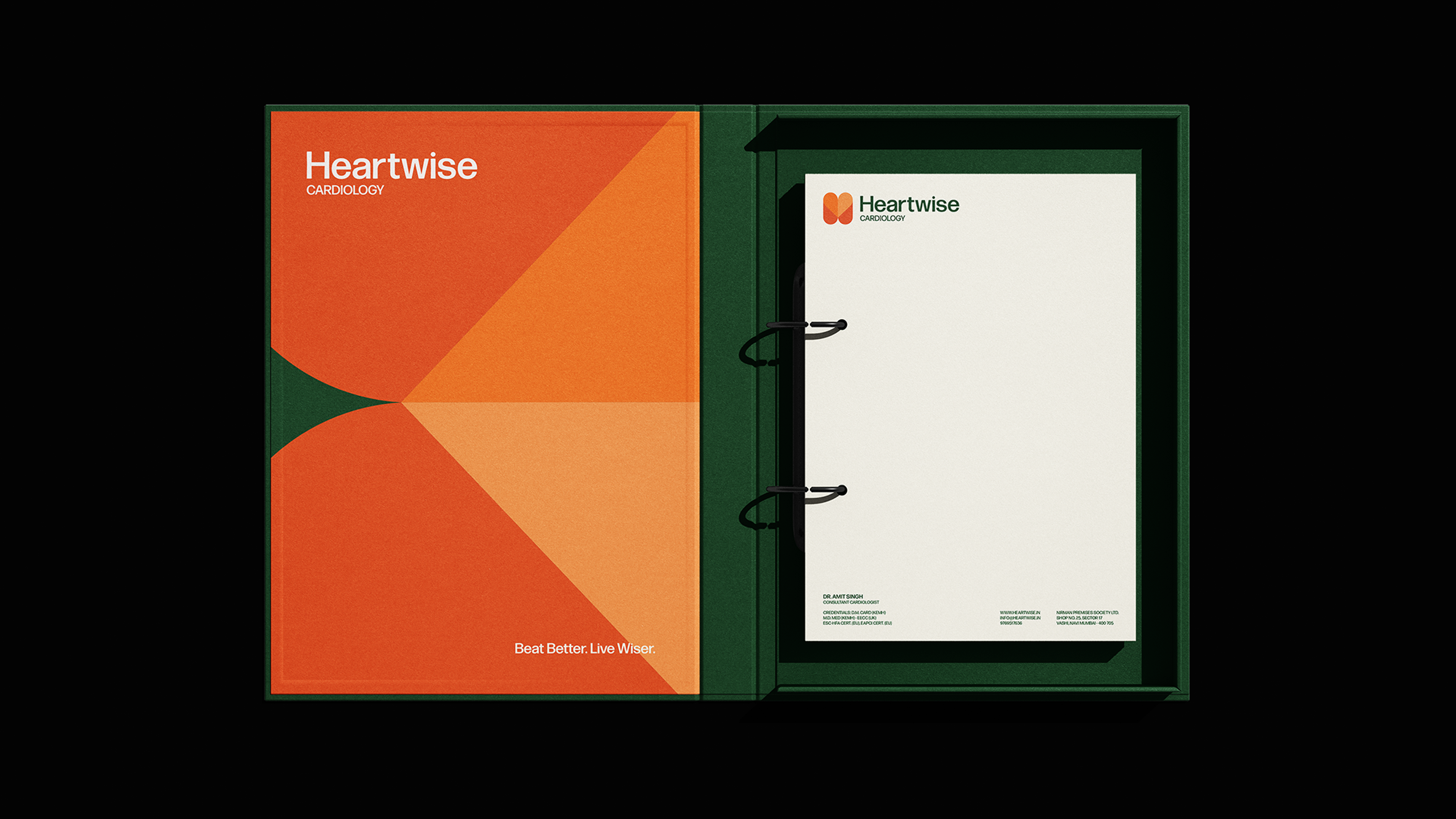
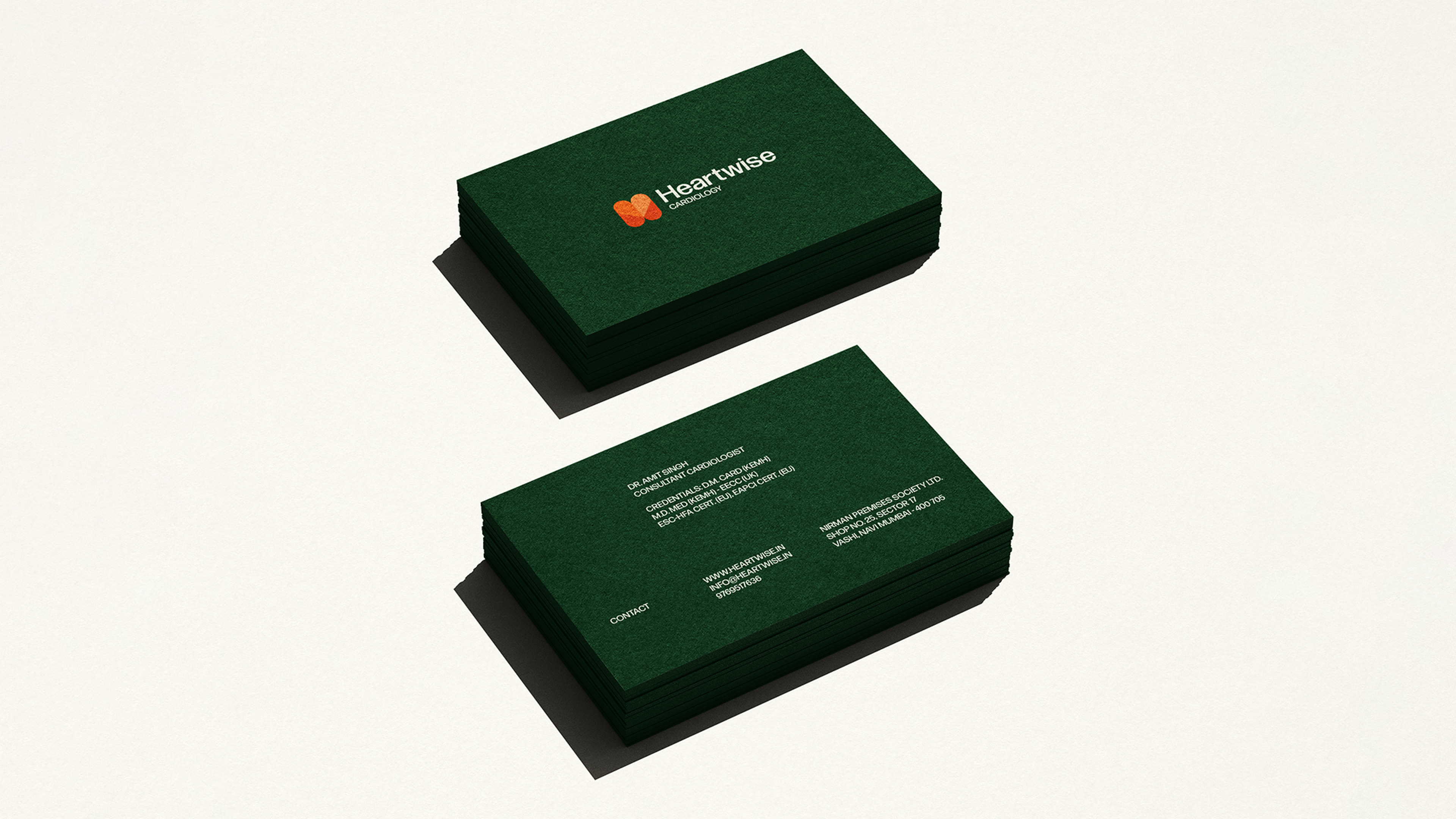
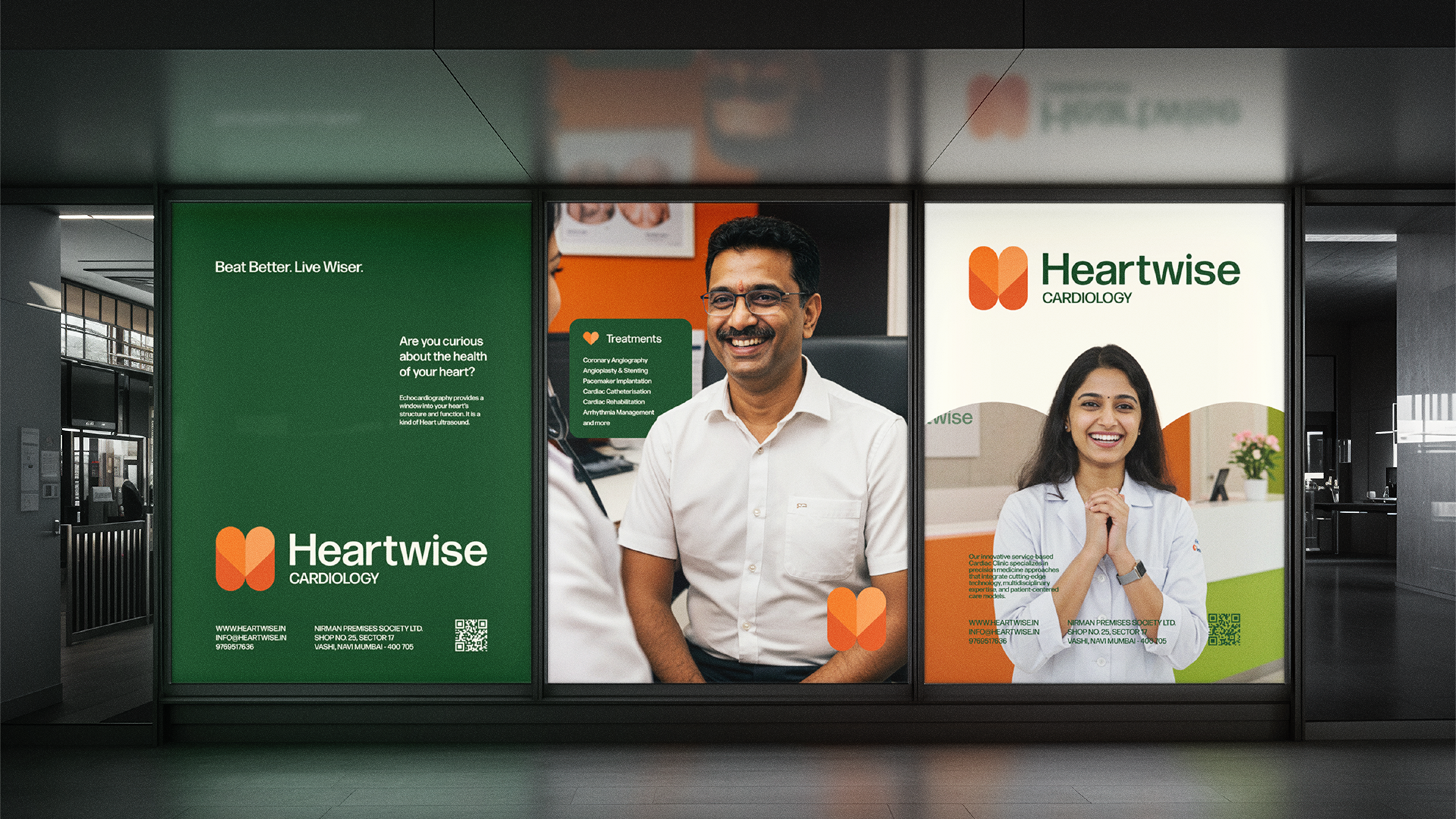
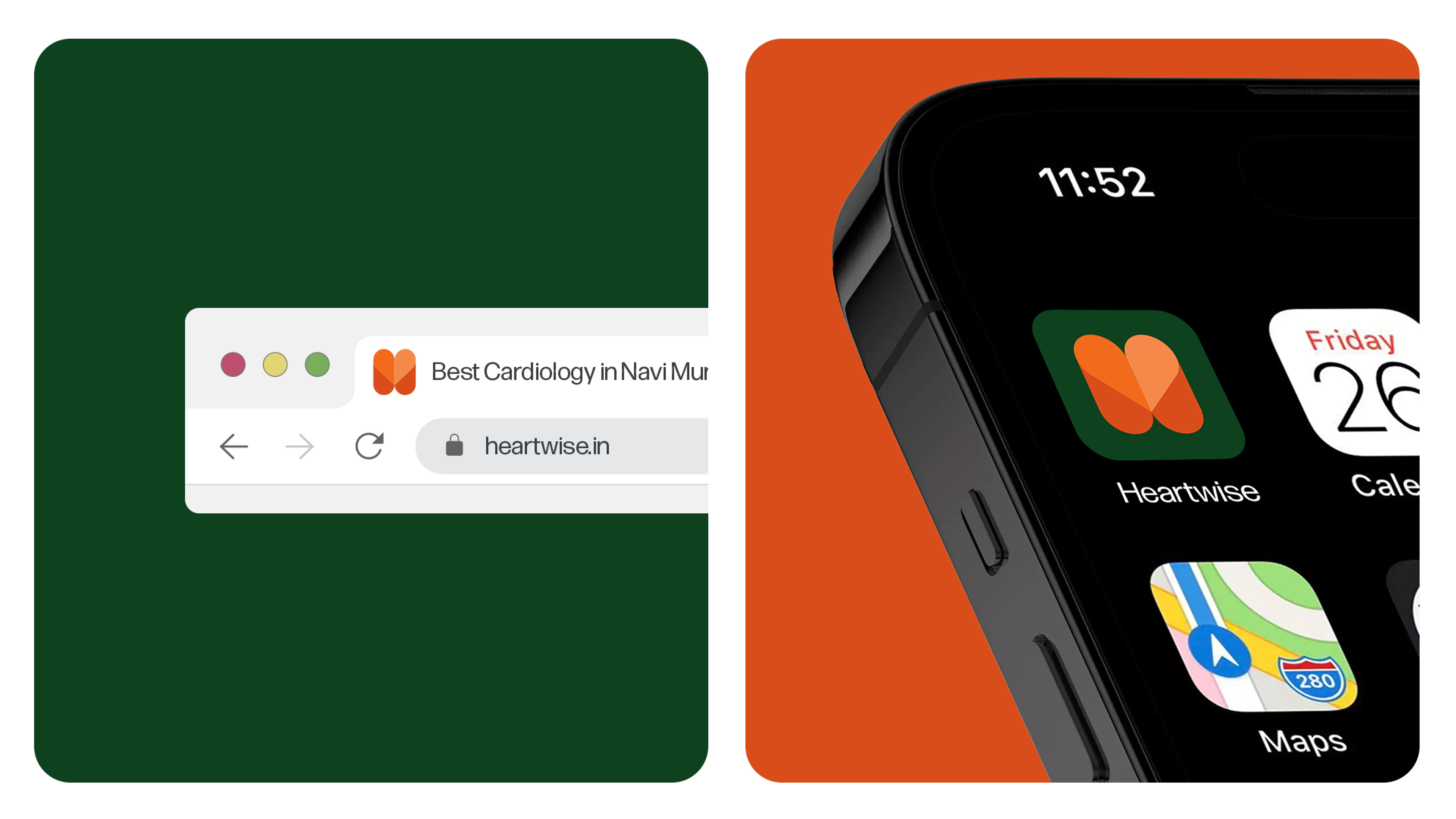
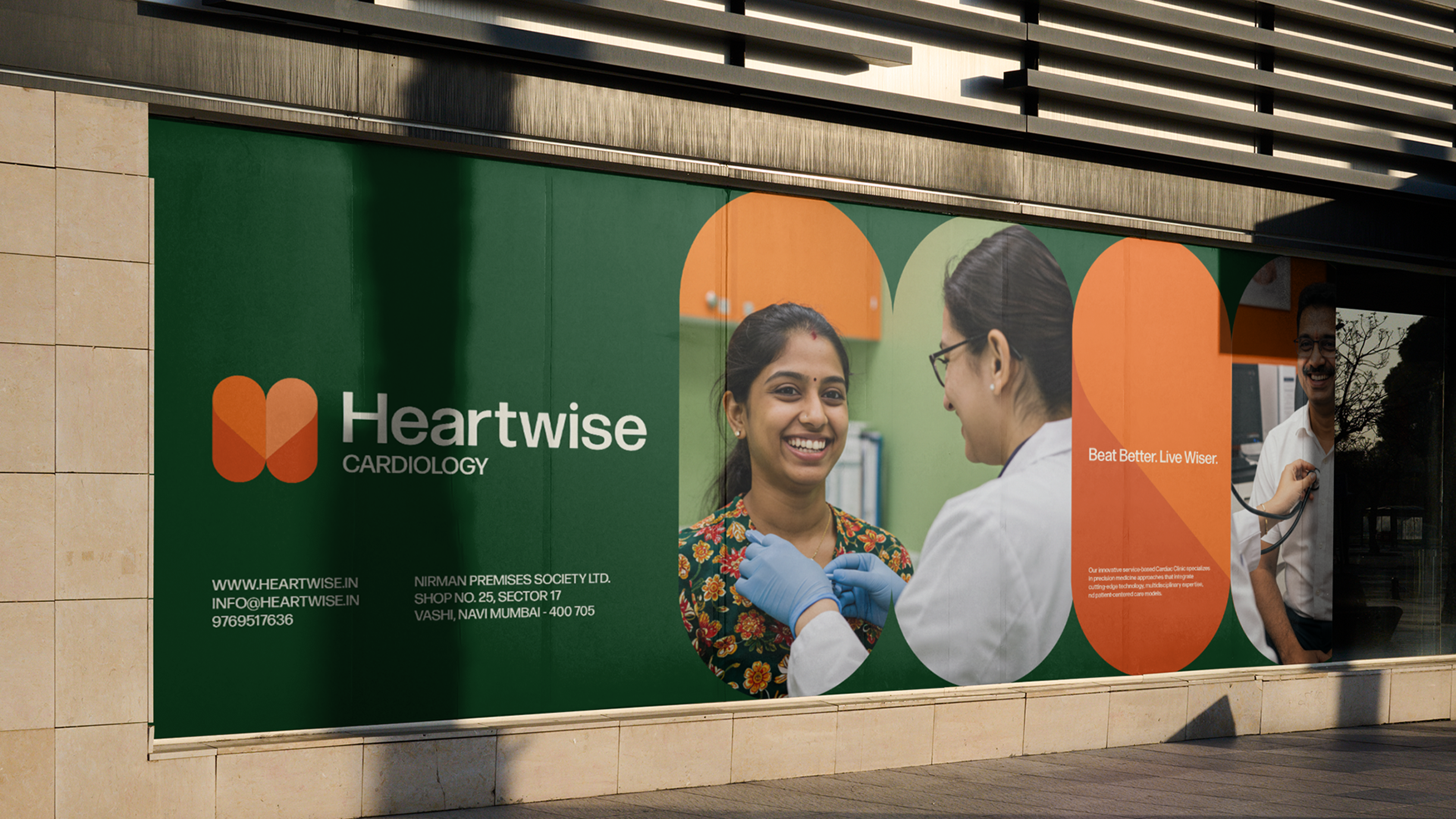
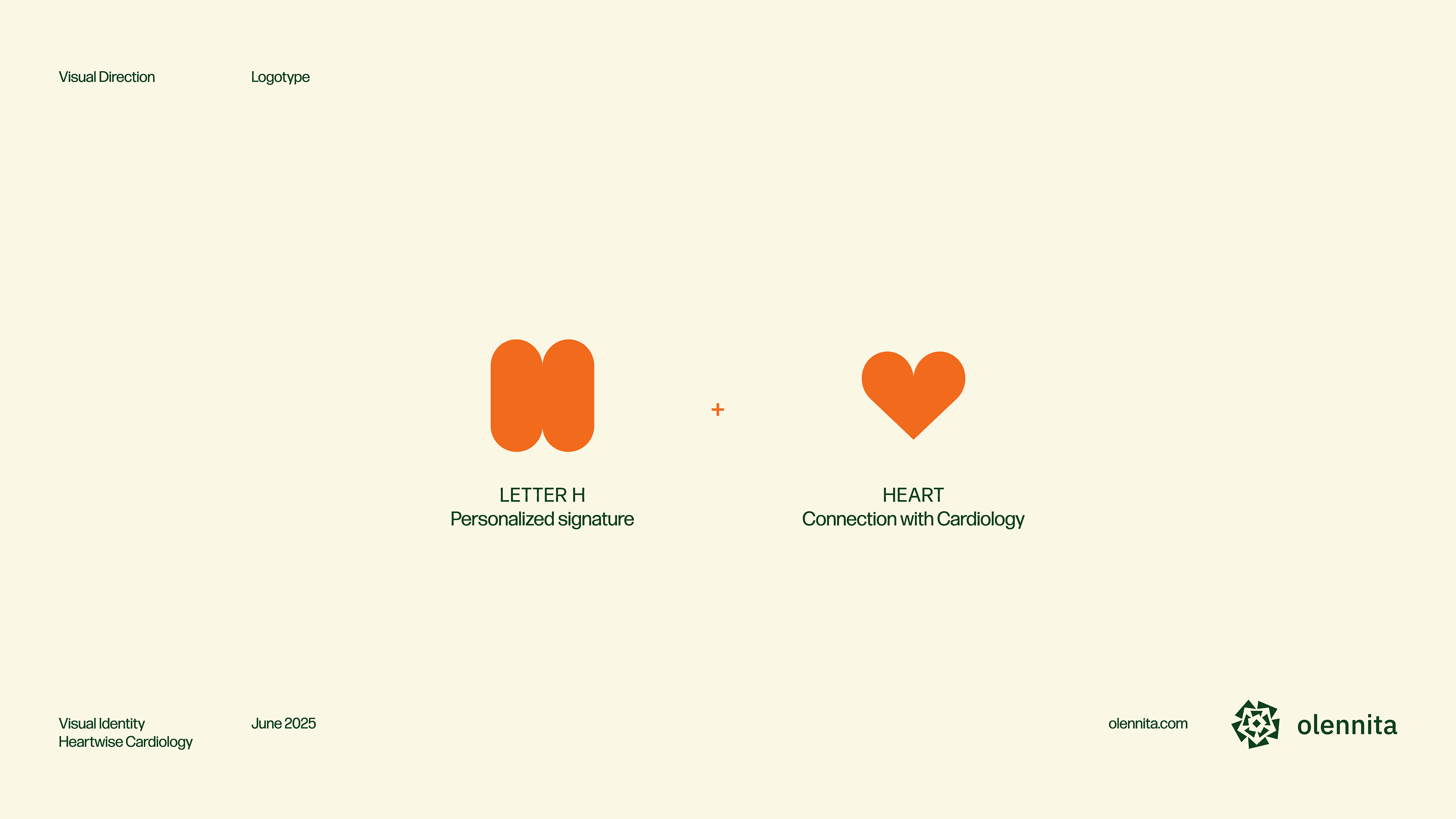
At the heart of the project is the logo, which merges the letter H with a heart symbol, creating a graphic mark that represents both medical excellence and emotional connection. The negative space forms subtle heartbeat lines, reinforcing the concept of life and rhythm. This solution perfectly encapsulates Heartwise's mission: to care for the heart with both science and sensitivity.
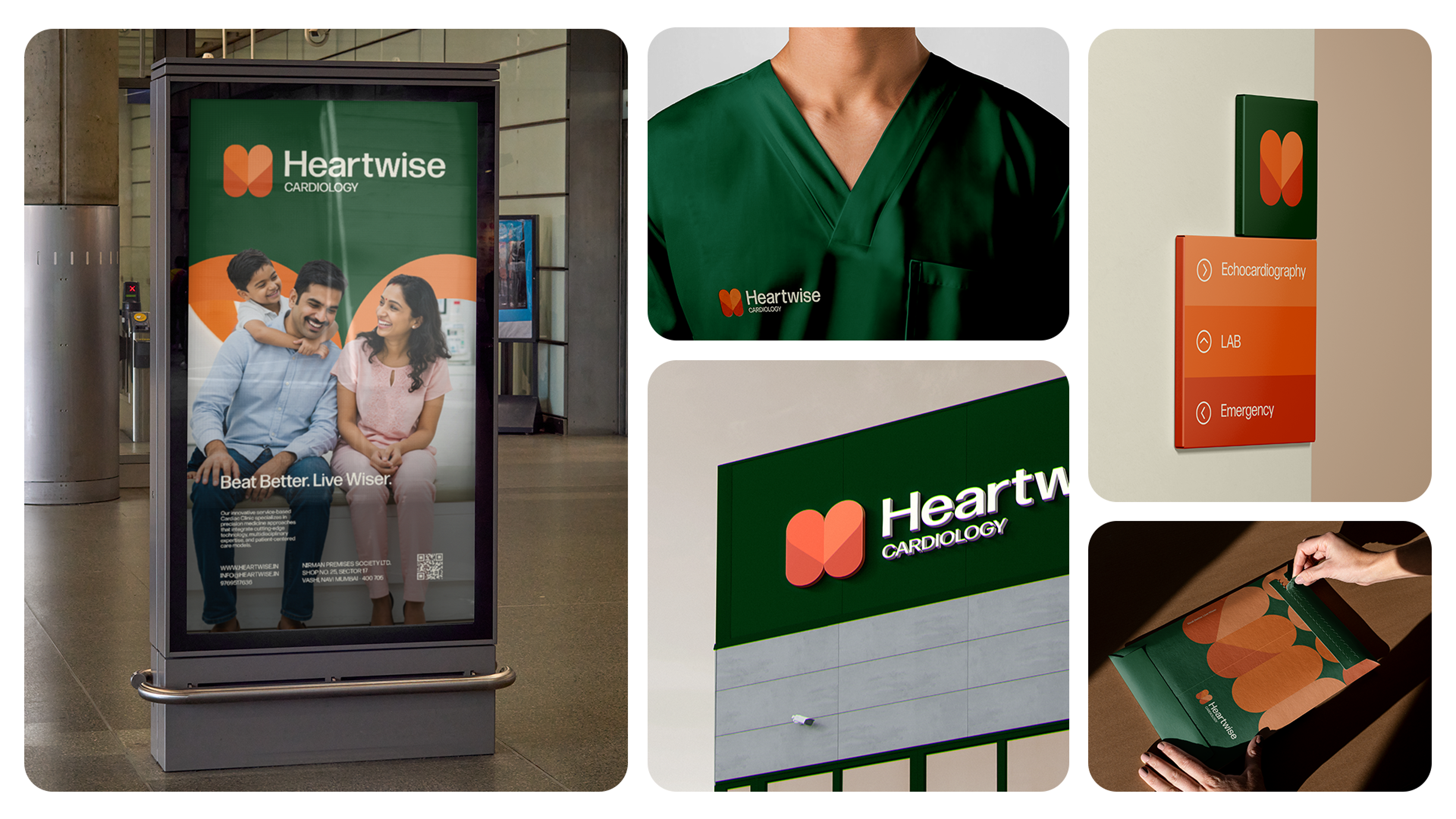
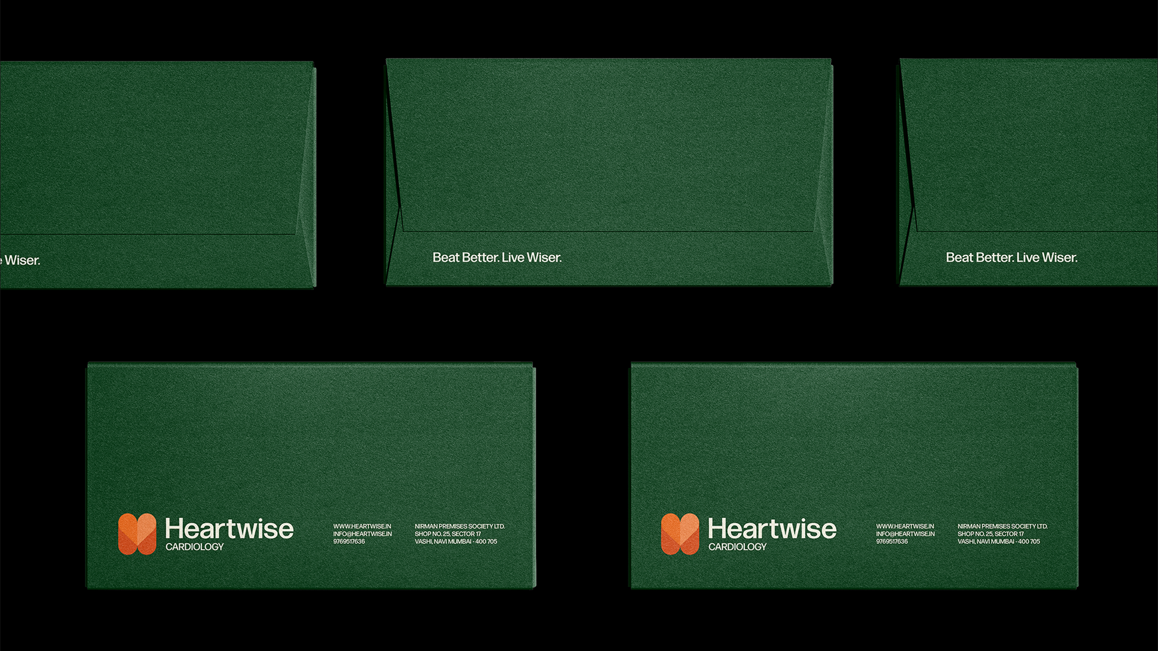
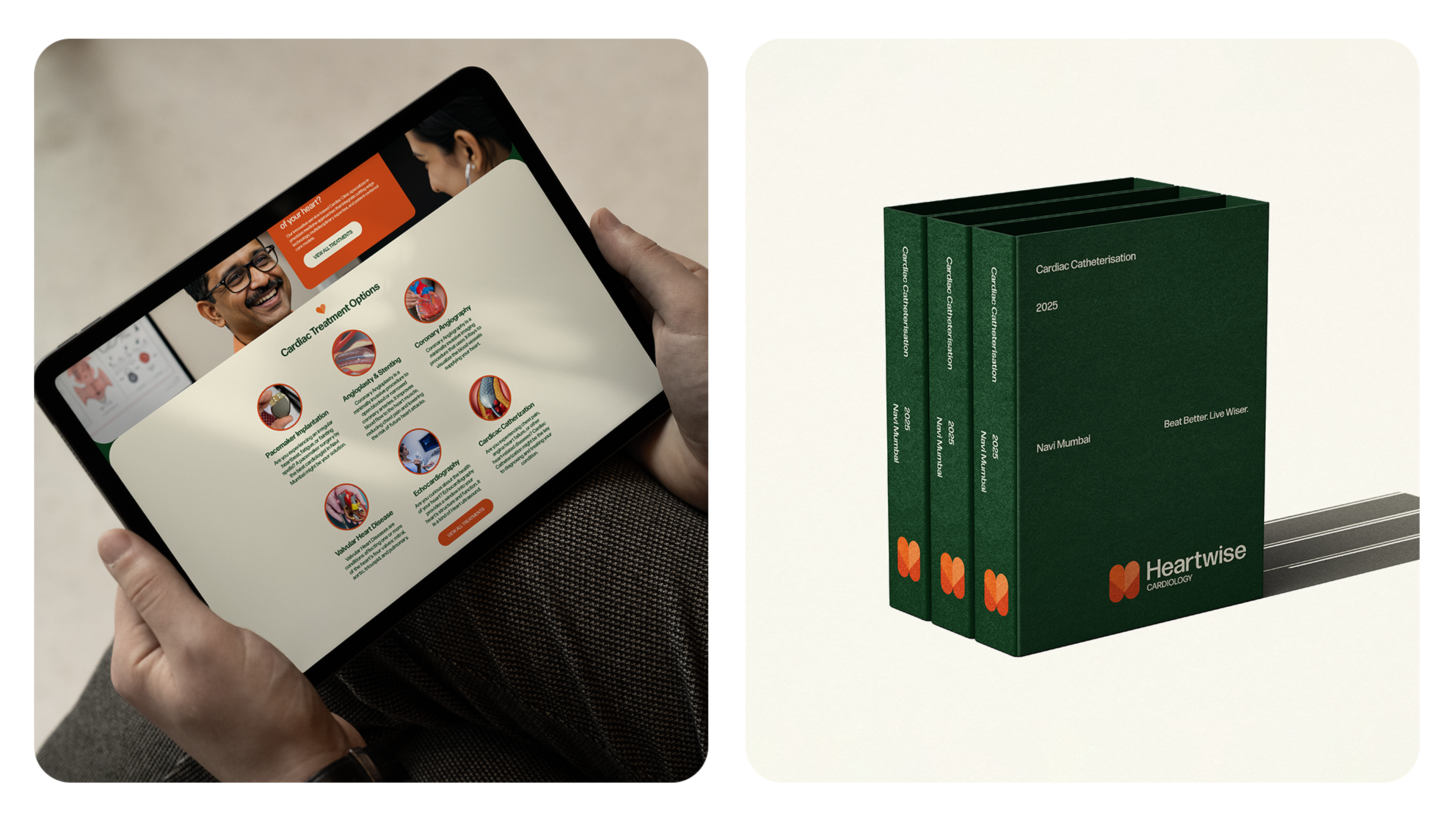
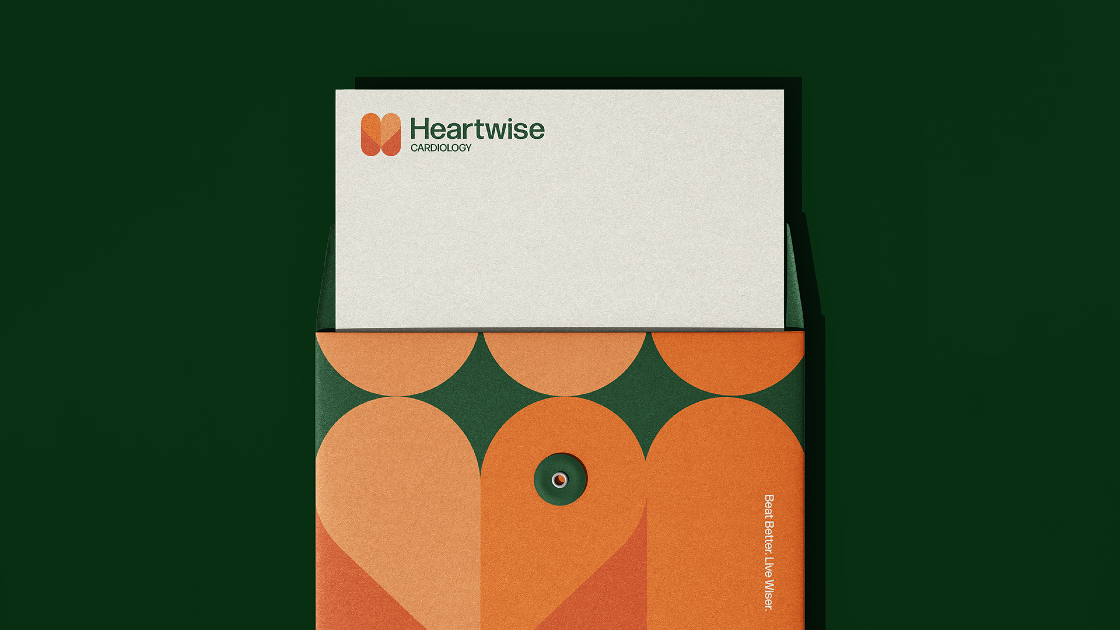
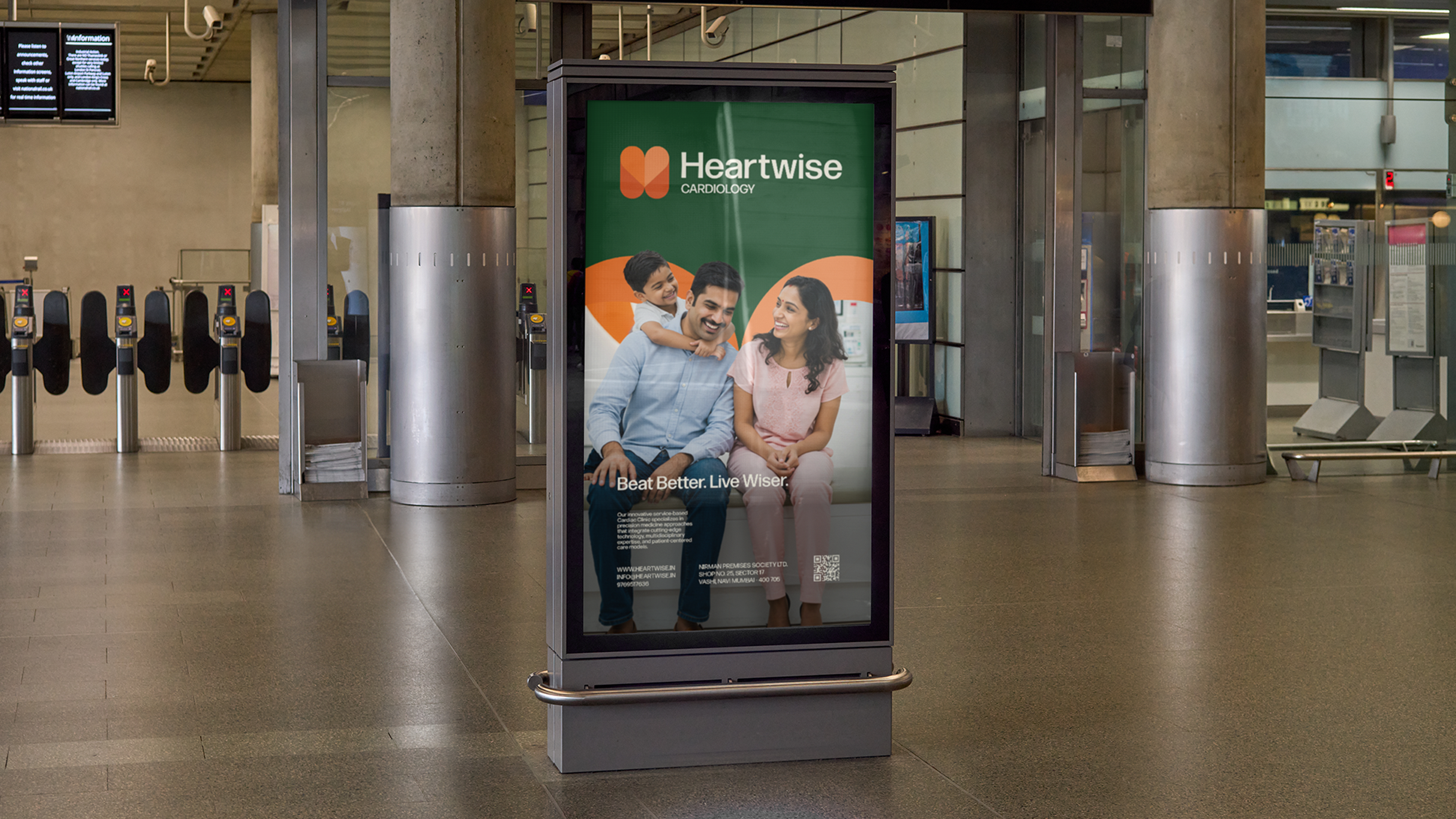
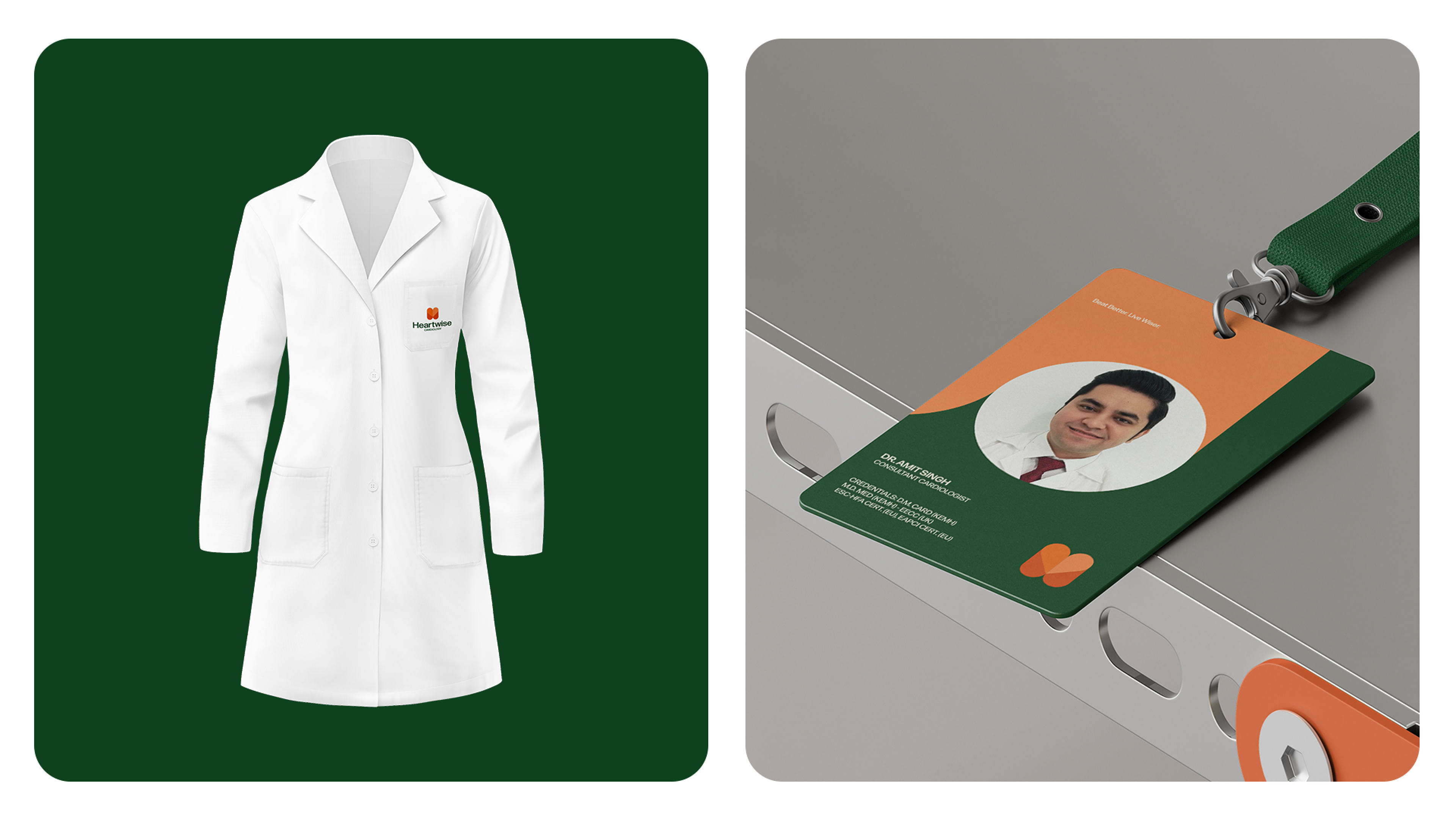
The result is a robust and versatile identity, adaptable across clinical materials to digital cardiac monitoring interfaces. Every element was designed to reinforce Heartwise's position as a leader in modern cardiology, where artificial intelligence and holistic care work together to redefine the future of cardiovascular health in India.
This identity not only differentiates the brand in the competitive healthcare sector but also establishes a new visual standard for cardiology clinics – proving that technical precision and human warmth can coexist within the same design system.
Client: Heartwise
About: Cardiology Clinic
Year: 2025
Follow for more: @OLENNITA
Follow for more: @OLENNITA

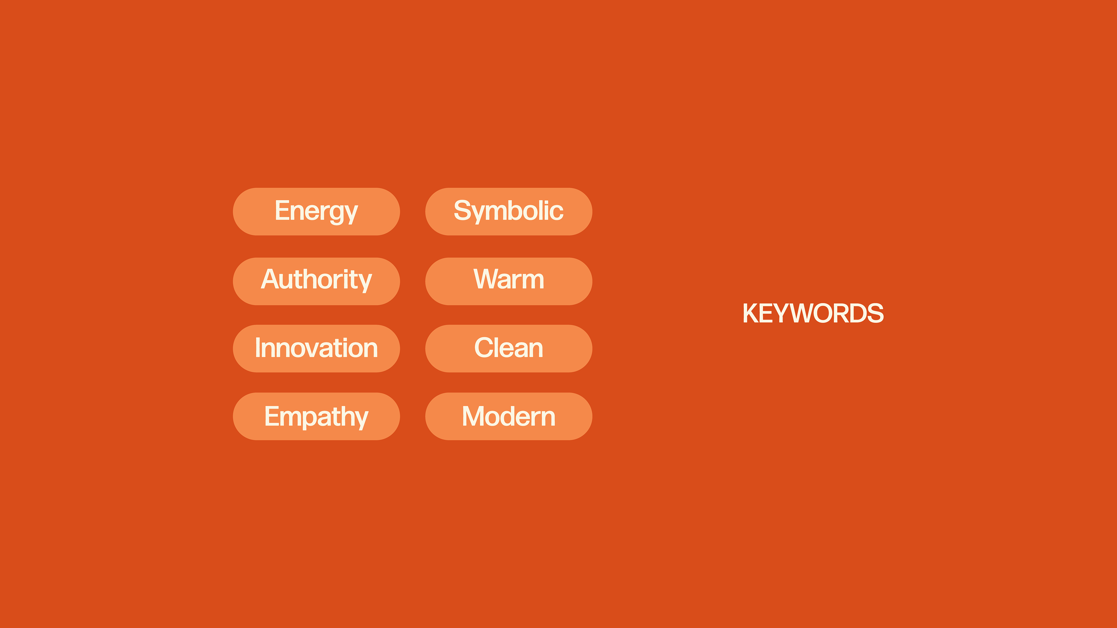
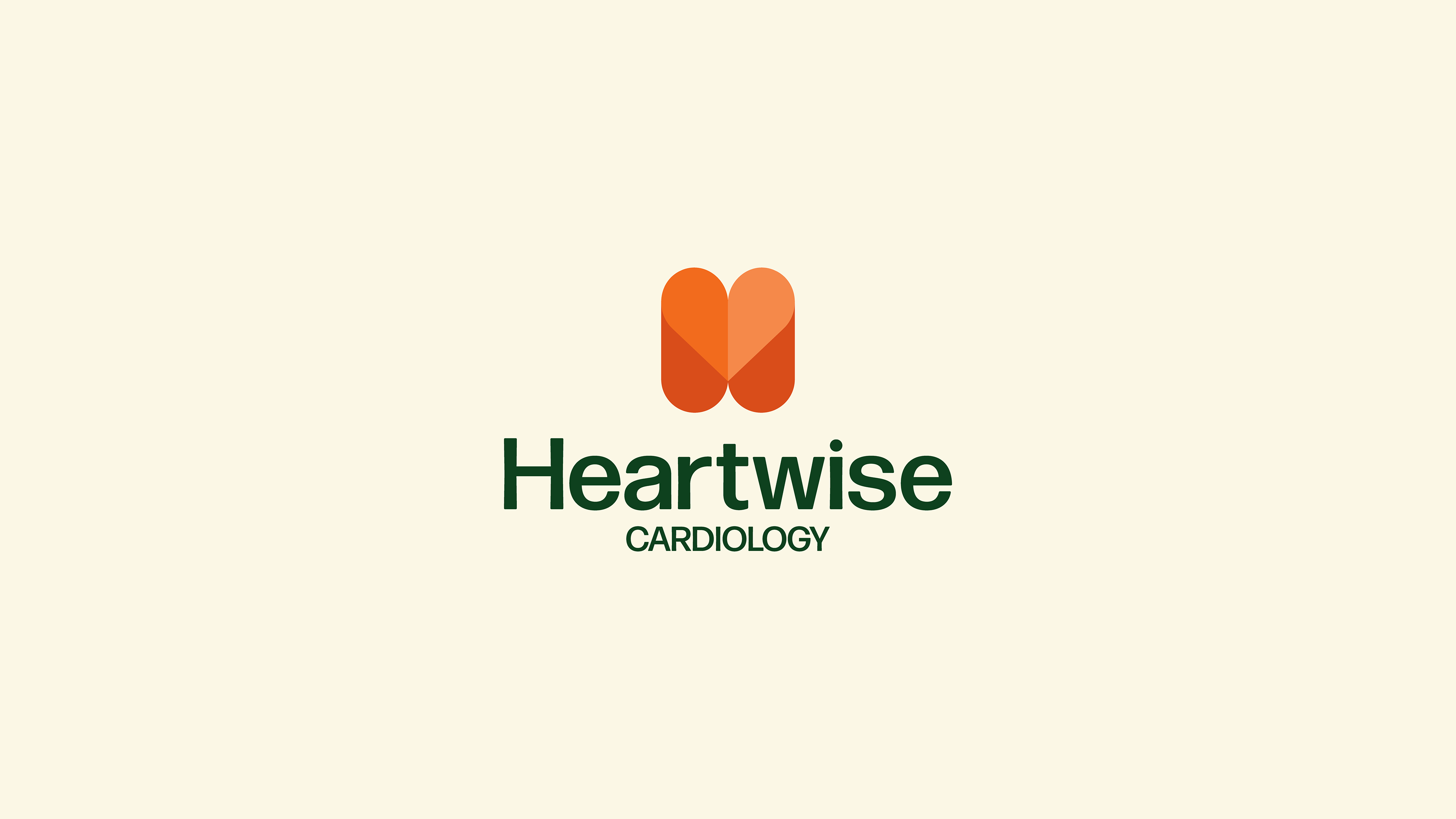
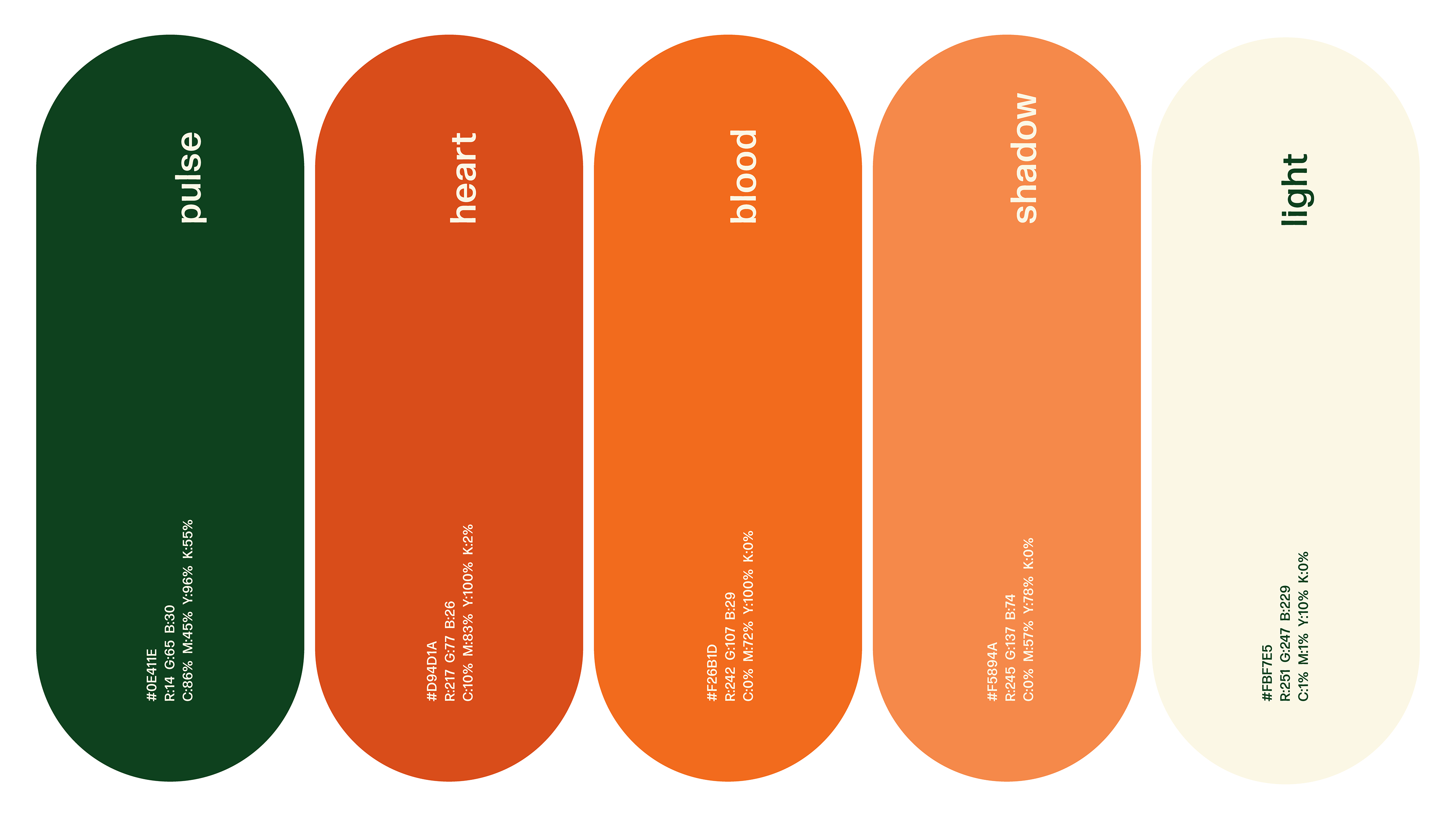
The chosen color palette reflects trust, vitality, and innovation—core values of Heartwise Cardiology’s mission to revolutionize cardiac care in India. Each color has been carefully selected to evoke specific emotions while ensuring visual harmony and brand recognition.
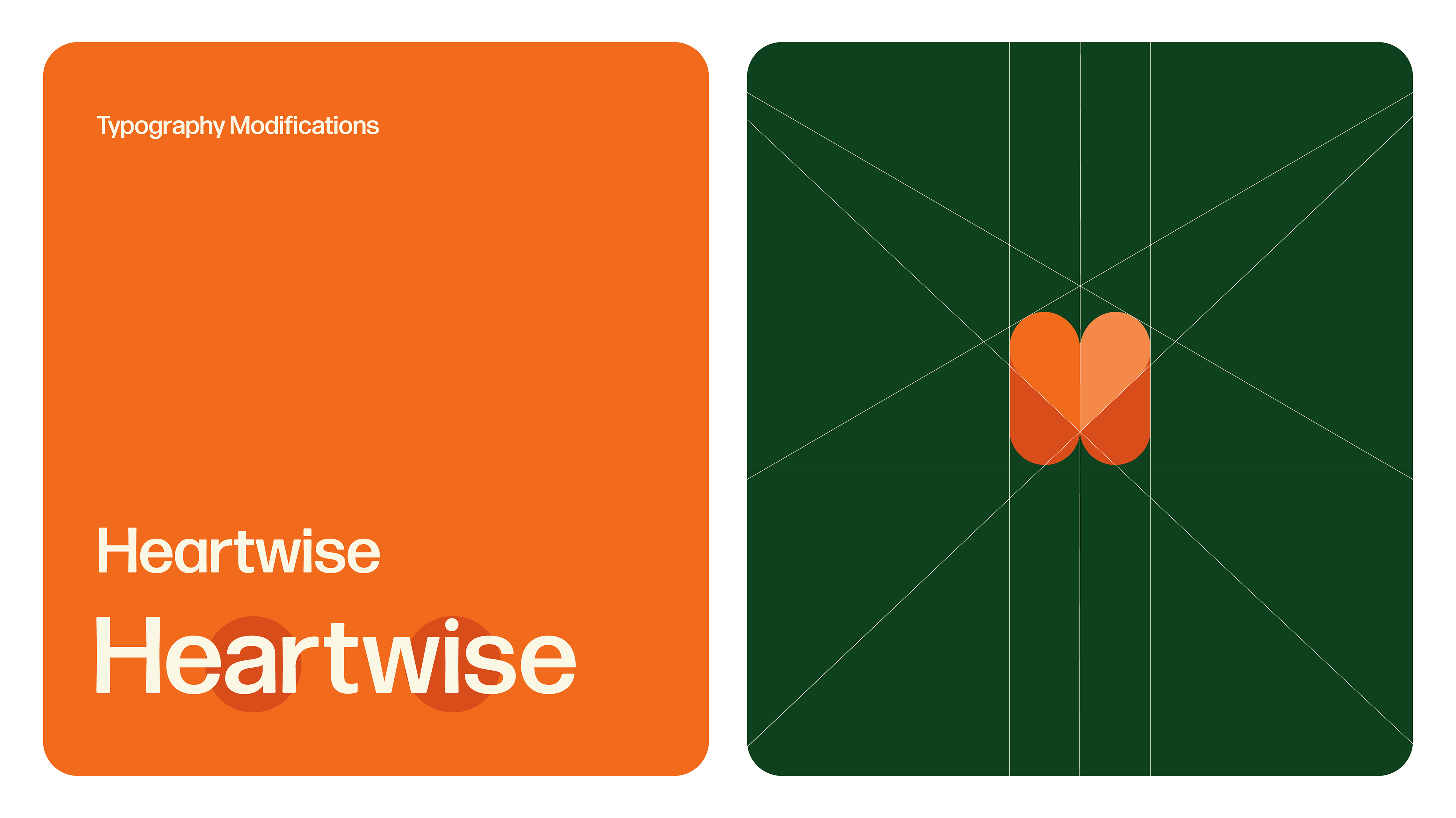
A clean, geometric typeface with subtle warmth. Its versatility (bold for impact, regular for readability) reflects Heartwise’s blend of precision and empathy.